 |
 |
Graphic Greats 4: Texture Touches
|
| |
|
|
|
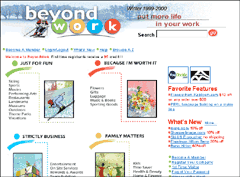
BeyondWork
entry page with just a few rough touches for the personal touch. ©
BeyondWork.
|
|
BeyondWork
This site is almost a classic, clean, white siteuntil you wonder
why it feels so good and look closely. The addition of a few swashes
of color, hand painted pictures that occasionally break out of the border,
and a well laid out information path make all the difference. This site
should be great inspiration if you would like to try adding a little
texture to your design, but your clients want the classic look. BeyondWork
services corporate clients, plus employees and families of member corporations,
so the professional look and friendly mood are equally important. The
site was created in-house.
|
|
|
|
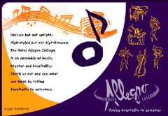
Hotel
Allegro entry page featuring hand-drawn graphics and rich colors.
|
|
Hotel
Allegro
This site accomplishes something I have rarely seena very elegant
look with rough elements. There are hand-drawn illustrations and a wavy
font, yet the first impression is certainly different than the other
sites we have seen in this article. The smooth, curved lines help to
break the rough look, as does the color scheme. Very few colors have
been used, and they are what we commonly think of as elegant colorsnavy,
gold, purple. An excellent site for a luxury hotel, providing confidence
in the quality with the elegance, and putting the welcome mat out with
the rough illustrations.
|
|
|
| |
|
|
|
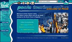
Poole Tourism Online entry page. Site was originally
designed by RedWeb with many
design changes credited to 4T2 Multimedia.
|
|
Poole Tourism Online
This UK destination site sneaks in many textured features without losing
an in-control and professional look. The wavy left border is unexpected,
but quite smooth. In the top left corner, the animated graphic spells
out Poole in a rough font. The menu items are hand-drawn
and are animated slightly, plus the attention attracting box in the
center of the page has rough top and bottom edges. At first glance,
like the BeyondWork site, this one seems fairly conventional. It is
the few unconventional bits that caught my eye and prevented me from
sailing by. That is excellent design when you can attract visitor attention
without hitting them over the head.
On the next page, you will see examples of very gentle texture that
still does the job.
|
|
|
|
Next page
Graphic Greats Index
Maxfunds.com Profile
Crooked with Color
Texture Touches
Subtle Power with Texture
100% Rough
  
|
 Find a programming school near you