Graphic Greats: Production Graphics with Wendy Peck at webreference.com | 16
 |
Graphic Greats 2: Crooked with Color | |
|
A portion of the Linux Central entry page. Designed by Gonzalo De la Peña Andreu (e-mail link). © Linux Central. |
Linux Central Another retro look, but very different from the Maxfunds.com sample. I have included only a small sample of the entry page here to allow some of the details to show. You really should visit this site, designed by Gonzalo De la Peña Andreu (e-mail link). Hand-drawn menu items and attention points through the site help to provide a friendly look and easy access to important information. Note how many information sections are included on this entry page, yet it is not overwhelming because the page is so well laid out. If you are faced with trying to present a great deal of information in different forms, you should study the methods used on this page. This version of the site was launched in January 2000. |
|
|
|
||
|
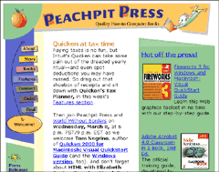
Entry page for the Peachpit Press site, designed in-house and launched in 1994. © Peachpit Press. |
Peachpit Press The Peachpit site is very casual. There is hardly a straight line anywhere, yet observe how your eyes move through the site. You cannot be successful at this style without very careful planning. Creative color breaks define information areas. Geometric shapes work with table cell background color blocks to create irregular shapes, providing energy with little extra file size. |
|
|
|
||
|
Starbucks Coffee entry page. Several designers had a hand in the final look. © Starbucks Coffee. |
Starbucks Coffee We've seen the roughest of the rough, now lets look at sites that just push the straight boundaries a bit. |
|
|
|
Graphic Greats IndexMaxfunds.com Profile |
|


URL: https://www.webreference.com/graphics/
Created: Mar. 8, 2000
Revised: Mar. 8, 2000
 Find a programming school near you