That Darned Content pg 3: Production Graphics with Wendy Peck at webreference.com
 |
That Darned Content: Bigger is Not Better for Text | |
|
Making text loud and obnoxious by increasing the size will not lead your site to success. Remember that words per line is an important factor in legibility. Plus, this is ugly and really hard to read. Text that is sans serif, with default settings packs in too closely, especially for the rounded characters in Verdana as shown here. When it is smaller, the line spacing in proportion to text size increases, and there is enough white between the lines to make the text easy to follow. Note: Mac designers will probably not see what I am talking about with this sample, and that is something you should pay attention to. See the screen shot in the right column below.
|
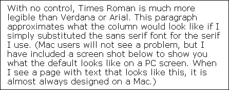
When I say we are going to talk about text size, I'll bet your first thought would be (if I had not given you the answer with my title) that I am going to talk about not using small fonts on your Web sites. But you would be wrong, although you do have to be careful to keep the text size legible. PC designers must realize that text they specify at below 9 points will break up on a Mac screen. I don't mean that the text will be too small to read, but that pieces of the characters will be missing. It's tough enough to read small type when it is intact. With holes in the characters it is impossible. But my real point for this section is to talk about text that is too large. Many designers will increase the font size in an effort to make the text easier for people to read. Often well-intentioned designers attempt to accommodate an older visitor base, or those who are visually impaired by turning up the font size to almost ridiculous levels. The sad irony is that the opposite usually occurs, especially when using sans serif fonts with no line height control. The sans serif default fonts do not provide a good line spacing at default size. In fact, I have had many people ask me why I use a serif font on this page. The answer has to do with line height and default size. This column is part of a larger network, and there are restrictions to what I was able to do for text control. I was asked to keep text control through CSS to a minimum, depending on the master CSS file where possible. I was not able to use a fixed font size, as it is important with as many visitors as WebReference.com receives to allow visitors to make their own choices. With no control, Times Roman is much more legible than Verdana or Arial. This paragraph approximates what the column would look like if I simply substituted the sans serif font for the serif I use. (Mac users will not see a problem, but I have included a screen shot below to show you what the default looks like on a PC screen. When I see a page with text that looks like this, it is almost always designed on a Mac.)
|
|
 |
||
|
Although my preference is a sans serif font on the Web (in print, as well, except for the most text-booky type books), in this case, the serif font is the more legible choice. When you are not working under the restrictions I have for this column (and necessary restrictions they are I don't want to seem like I am whining about this choice) you can increase line spacing, but even with enough space between lines, the text above would not be as easy to read as the smaller sans serif font sample in the left column above. |
||
|
|
That Darned Content: Tutorial IndexHey, Wait! That's What It's all About |
|
Created by Wendy Peck,
URL: https://www.webreference.com/graphics/column51/
Created: September 6, 2001
Revised: September 6, 2001


 Find a programming school near you