That Darned Content pg 5: Production Graphics with Wendy Peck at webreference.com
 |
That Darned Content: Creating Logical Areas for Text | |
|
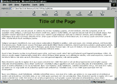
Such a boring and hard to read presentation for information. The content could be excellent, but most visitors would miss it.
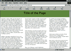
Dramatic improvement just by breaking exactly the same content into columns. Be careful with columns, however. You do not want your visitor to be scrolling down and then up to read through your information.
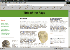
It doesn't take a lot to bring a page to life. Although you must have the images to replicate this change, note that I have also used color and lines to break the text into smaller pieces. Which of the above pages would you rather read? |
Breaking text into pieces helps to make content easier to read for your visitors. Bullets condense vast amounts of information into tidy packages. But what if even those techniques are not enough to make your content easy to read? Try separating your text into areas, rather than letting it run together in a long, unbroken mass. Break Content into Columns Columns do not have to be created in equal widths. This page is broken into one small column that never exceeds 240 pixels wide, and a larger column that contains the content. Although this format is perfect for presenting screen shots or illustrations beside the topic describing a technique, it is also generally good for presenting any information. Note: There may also be an ad column at the right of this page. Look for areas in your text to create "sidebar" pieces that are placed in another column. Line length is not as important for a short piece of text, so don't worry too much about short line lengths in sidebar-type passages. Use Images and Graphics to Break Up Text Areas Make sure you are using appropriate graphics, however. As a reader, I would far rather plow through solid text, than have my eye stopped for an unrelated graphic. Any graphic is not better than no graphic. If you do not have appropriate art to use on your page, turn to graphic elements like lines, background color or bullet-like images to help direct your reader. I have worked on projects with text that looked like it was a solid piece of work, and could not be broken down. However, once I focus on the problem, and really mine through content for division points, they are always there. Be careful that you are not changing meaning, but text that is carefully arranged into bite-sized pieces is so much easier to absorb that the effort is well worth it. We will come back to this subject when we focus on breaking page content into areas with graphic elements. Starting today, keep your eyes open for opportunities to break your text into columns, headlines, sidebars or even teaser menu items. |
|
|
|
||
|
|
That Darned Content: Tutorial IndexHey, Wait! That's What It's all About |
Created by Wendy Peck,
URL: https://www.webreference.com/graphics/column51/
Created: September 6, 2001
Revised: September 6, 2001


 Find a programming school near you