Menus with Beauty and Brains 5 pg 3: Production Graphics with Wendy Peck at webreference.com
 |
Menus with Beauty and Brains 5: Creating Slices and Rollover Graphics | |||||
|
New design for a menu in its final form. No slicing has been done.
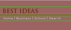
Guidelines show where the slices will be applied. Lines and background will be completed in the HTML page with background and table background tags, with small GIF files used to create lines, or set the size for table rows. |
The first step to prepare your graphics to export as rollover images, is to decide where you will slice the image. I spend some time at this stage, because I want to leave behind as much of the image as I can. Remember, I advocate using HTML commands for background color as much as possible. Planning your slices is the most important stage for reaching that goal. In the sample at the left, the top image is the proposed final appearance for the normal state. The second sample includes horizontal guidelines placed to show where I will be slicing. See how I have started the first slice just above the title graphic. I can fill in the area above the graphic by specifying background color, and placing the image at the bottom of the table cell. Likewise, I have excluded the red line. Lines can be added with almost no file weight, by creating a 1 or 2 pixel graphic of the desired color. This graphic can be placed anywhere in the document, with the image size specified to create the line size. For liquid design, I use a clear GIF file with the desired height specified, and background color, even for fine lines like this one. This method allows me to specify the width of the line in percentage values. See Menu Bars for Liquid Design. No matter how you accomplish the background and design lines in your final document, plan at this stage to translate them into HTML commands, rather than including them in images, wherever possible. We may only be saving a few pixels at a time, but they add up over an entire site. Your design is also much more flexible when you are creating pages with elements, rather than simply piecing together a sliced image. With this in mind, let's move to the slicing. |
|||||
|
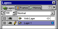
The Layers window showing the Web Layer, which contains the slice and hotspot information. |
Slicing an Image It is important to keep the Web Layer separate from the objects in your mind. When you make a change to an object in your document, the slice that was associated with that object will not change. Slices are determined by position within the document, not by any object. |
|||||
|
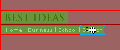
Slices are created with the Slice tool only in the areas you wish to create graphics. As explained earlier, this image will depend on background color and GIF files for the red line. |
To work in the way I have been describing, using Fireworks only to create images, not HTML, you will create slices only for the areas you wish to save. With the Slice Tool active, click and drag over the area you require for your first slice. The boundaries of the slice will be the edges of the resulting image. Drawing a slice will automatically make the Web Layer visible and will, if the default remains, display as a semitransparent, green rectangle. The sample at the left shows the slicing in place for this image. Note that the last slice in the menu area is selected. The red lines are created by Fireworks as guides to draw subsequent slices in a row. |
|||||
|
Creating a Rollover |
||||||
|
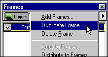
Creating a new frame that will be used as the Over state in our rollovers.
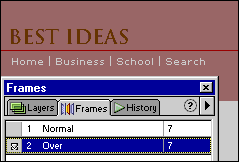
The Over frame is identical to the Normal frame (formerly Frame 2 and Frame 1 respectively). Changing objects on the Over frame creates the rollover effect. |
With the slices in place, we are going to create a new frame and design our "over" image. In most cases, it is best to start from the identical look as your normal view in order to make sure that your over and normal image line up properly. It can be very disturbing to have states of an image off by even one pixel. Perfection is the minimum standard when creating rollovers. Creating a new frame is very simple. Activate the Frames window, and make sure that the Frames palette is active. You should have only Frame 1 showing in this window. Click the side arrow on the Frames palette and select Duplicate Frame. Select After Current Frame from the popup that appears and the original frame will be duplicated and appear as Frame 2. To make it easier to understand the process, double-click on Frame 1 and rename the frame Normal. Double-click on Frame 2 and rename the frame Over. Because you have duplicated the Normal frame to create the Over frame, both are identical. If you look at the sample at the left, you can see that the new frame, now Over, is active, yet the image is the same as the original image seen at the very top of this page. Fireworks will include images on both the Normal and the Over frame when we export the images. All that remains is to change the Over frame objects to the required effect. |
|||||
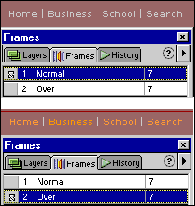 |
After all the preparation, creating the the rollover effect is anticlimactic. Simply activate the Over frame and change the elements in the image that you wish to create a rollover state for. Usually, we are simply changing the color of text, or adding or removing an effect. For this sample, I changed the menu text from a light gray to orange. The first illustration at the left shows the Normal frame active with the original text color. The lower image shows the Over frame as active, and the orange text visible. Note that I have left the menu dividing bars in the original color. Although we have a few more steps, I have included the completed menu below so you can compare the graphic steps to the final result. I have created this menu in a table, with background color providing the decorative elements. |
|||||
|
That's it! Your graphics are created. We still must look at optimizing your slices, and finally, exporting the graphics. |
||||||
|
|
Menus with Beauty and Brains 5: Tutorial IndexFireworks Rollovers |
Created by Wendy Peck,
URL: https://www.webreference.com/graphics/column48/
Created: May 25, 2001
Revised: May 25, 2001



 To
create a slice, you use the Slice tool, shown at the right, highlighted
in yellow. You turn off the Web Layer, or slice visibility, with the
Hide/Show Slices button at the bottom of the toolbox, highlighted in
red. This button does just as it claims, hiding or making the slices
visible. The slices remain on the Web Layer until you change them, whether
or not they are visible.
 Find a programming school near you