Photoshop and PSP Channels: Production Graphics with Wendy Peck at webreference.com
 |
Photoshop and PSP Channels: What, When and Why? |
|
|
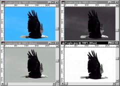
One image, four views. The image at the top left is the "normal" view for a Web image, or one with the red, green and blue channels combined. The top right image shows a grayscale image containing only the red pixels. The lower left image is green only pixels, and the lower right displays only the blue pixels. Photos © Tom Thomson Photography. |
I have been meaning to return to the very basics of raster functions that so many of you request, and this week I finally found my way back. We have already looked at masks and selections, plus layers. Channels have the spotlight for this tutorial. Print designers work with channels all the time, since the color separation required for all printing is represented by channels. However, for Web design, we have no need to use channels when we save our images. We often ignore that channels even exist. In all honesty, if you never crack open the channels palette, or in the case of Paint Shop Pro, separate your document into channels, you can still produce highly professional work. However, there is a reason to open that palette. When you separate your document into channels, you have just turned on your fine tuning capability. Have you struggled with an image that seemed to require both sharpening and blur? The answer may be as easy as working in only one channel. Or sharpening the red channel, removing noise from the green channel and applying a slight blur to the blue channel. The is no filter or adjustment that can simulate what you can do my manipulating individual channels. And don't forget, channels are also used to hold our masks, which is how any saved selection is represented. (See Masks are Easy ... Really.) |
|
|
Red, green and blue separated on the left, and combined to create the final image at the right. I lightened the red sample here to make the eagle easier to see. |
What is a channel? When we look at a colored image on our monitor, we are actually looking at a combination of only three colors: red, green and blue. It is a combination of the three colors that produces the millions of colors we see. Look at the image at the left. I have broken an image into the three color channels that make up the final picture at the right of the image. When we are working with channels, the red, green and blue are usually represented with a grayscale image, but I have used the actual color here to illustrate the concept more clearly. |
|
|
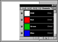
100% of red, blue and green will result in a white display.
Photoshop Channels palette with preferences set to display color, rather than a default grayscale image for each channel. |
Red + green + blue = white. What? Having trouble believing me? The lower image at the left is taken with Photoshop set to show the channels in color (select Edit > Preferences > Display and Cursors and check Display: Color Channels in Color). The document is a one layer image with a white background and the channels view shows the colors that are used to make the white that you see. Why is this important? Because if you want to reduce the effect of a color in a channel, you have to make it darker that is contrary to our natural instincts. I just want to get you thinking the right way (or is that the wrong way ... backwards ... adding color because it is a subtractive model ... nah, you don't really want me to go there). All that matters is that you understand that dark in a channel translates into less of that color. Light in a channel means more of that color. |
|
|
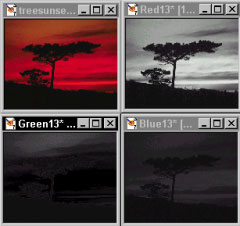
Default channel display is a grayscale image for each channel. In this Paint Shop Pro generated channel split, the top left image is the actual image. Photos © Tom Thomson Photography. |
Channel display At the left, I have included a set of images from Paint Shop Pro. The image at the top left is split into channels see the channel name in the title bar for each window. Notice how dark the green and blue channel images are. That means that there is a small amount of blue and green in this image. Not surprisingly, there is a lot of red in this image - the red channel is quite light, except for the land mass and the tree. If 100% of red, blue and green makes white, it only makes sense that 0% makes black. We have a near black land mass and tree, so the all the channels contain little color in that area. With that introduction, roll up your sleeves and check out how you can work with Photoshop and Paintshop Pro. |
|
|
|
Photoshop and PSP Channels Tutorial IndexPhotoshop and PSP Channels: What, When and Why? |
URL: https://www.webreference.com/graphics/column41/
Created: January 21, 2001
Revised: January 21, 2001


 Find a programming school near you