Photoshop Brush Strokes- Giordan on Graphics | 4
 The Crosshatch Filter
At first glance, this one doesn't look much different from the previous Angled Strokes Filter. The main difference is that the strokes always cross each other in Crosshatch, rather than allowing you to use just one direction.
 |
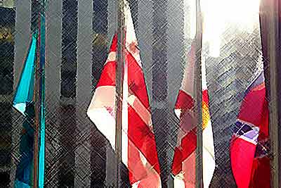
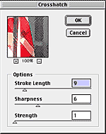
This is the result of the default settings, as shown below. I have to admit that it's not my favorite...
|
|
|
|
 |
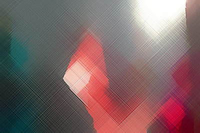
This one is interesting though. By optimizing the Stroke length and Strength sliders, we get a really nice geometric effect. Keeping the Sharpness down softens things a bit and creates a nice interplay between the strokes.
|
|
|
|
All Rights Reserved. Legal Notices.
URL: https://www.webreference.com/graphics/column 16/
Created: June 14, 1999
Revised: June 14, 1999


 Find a programming school near you