The Art of Animation. Animation principles
| Animation principles |
|
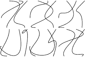
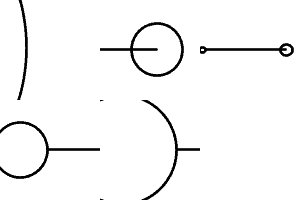
The first thing you should bear in mind is that, common as it is, animated graphics on the essentially static Web is still a very strong means on emphasis. As such, it must be used very reservedly so as to avoid annoying or overwhelming the user. For many designers, especially beginners, playing with animation is a lot of fun, but not always they manage to make it equally enjoyable for their viewers. Even if your goal is to dazzle your visitors by an intensive, high quality animated presentation (such as the olympic.org web site) - and if you possess sufficient design skills for such undertaking - remember to leave enough static keystones, i.e. objects of consistent position and appearance that will help your users to navigate through the site and get the message you want to deliver. Another, much more specific and much less obvious principle is: Follow the natural inherent motions for any objects you animate. In part, this is similar to the "learning from physical world" principle discussed earlier. However, natural motion is a bit more abstract concept; it's not as simple as apples always dropping down, and balloons, always ascending. Finding an engaging natural motion for an object may involve analyzing many of its aspects, including its inherent static dynamism, architectonics, common patterns of perception, etc. Thus, the text fragment in Fig. 1 moves horizontally exactly because we read it in that direction, which is therefore natural for such an element. (Note, however, that left-to-right is not always the most natural direction for textual objects.) Animation teasers used in my two previous columns (Fig.3) present a more sophisticated example. For Beziers, it is natural to "dance" with their endpoints fixed and the curvature range more or less constant; a superposition of three such dancing lines, with shifted phases, makes for an interesting animation sequence. For circles, one of the most natural "modes of operation" is blowing up (enlarging) and imploding back into a central point; combined with the push and pull forces applied to a horizontal line, they result in a simple yet neat movie making a good use of all of the available space. |
 |
 |
|
| a | b |
| Fig. 3: Each geometric figure has its own "most natural movement," which additionally depends on the current design context surrounding it |
| The rationale behind using natural movements is that our eye has already expected things to behave as the animator made them behave. The fulfillment of these expectations is the source of the psychological pleasure that translates into a high aesthetic estimate of the image we are viewing. However, to keep your viewer's attention, you need to learn the secret of "being engaging" rather than just "being natural." This is best achieved by using nonlinear motion patterns described in the next section. |
Revised: Apr. 14, 1999
URL: https://www.webreference.com/dlab/9904/principles.html


 Find a programming school near you