Designing a Designer's Site. The logo
| The logo |
|
From the very beginning my intention was to create as simple and generic a logo as possible, without tying it to any particular mission or activity. In other words, I wanted to create more a logo of myself than that of my design company. Ideally, the fact that it's related to design must be conveyed by the logo's graphic quality, not by any specifically design-related symbol. So, finally I decided for a logo made of my initials without any extra graphics attached to them. Of course creating even such a "simple" logo was by no means a simple process. The main idea of the logo, other than being "just a couple of letters," was easy to find. In squeezing the letters together (which is always the first impulse in working with the text of a logo), I simply entwined the two opposite serifs of "d" and "k" and was done with it. Indeed, it is hardly possible to come up with any other visual motive to be interesting enough yet not distorting the letterforms too much (which is the most frequent fault in text-only logos). This modest effect attracts your attention exactly because you feel that playing with serifs is probably as far as the designer can go in this case. Additionally, the somehow formal character of this feature (resembling some well-known geometric paradoxes, such as the Möbius strip) is a strong contrast to the "warm" humanistic feel of the font. The rest of the logo story took much more time and effort, although the visible outcome of these efforts is more difficult to notice. It comes to no surprise, since in working with the letterforms, my intention was not to embellish them, but on the contrary, to make them as obvious and transparent for perception as possible. I wanted to bring to perfection the characteristic outlines of the italic letters, but in such a way that their perfection is only visible to a thoughtful eye. As the base of the composition, I used Monotype Garamond typeface whose italic variety is a rich example of a late humanistic antiqua (my personal taste, compliant to the humanization trend of the last decades, mostly dwells in this epoch of the font history, also taking much delight in modern humanistic sans serifs). However, for the purposes of a logo this font turned out to be perhaps too tasty. |
 tarting this
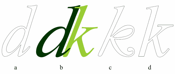
| Fig. 1: The origins of the logo's letterforms, or Only two letters, but so much font fun! |
|
The "d" from that typeface (Fig 1, a) was immediately usable, requiring only a
change in slant and some horizontal expansion. I
also lengthened and reshaped its serifs to better accommodate the letter to
clinching with its mate. Much more difficult was producing a good
"k" to match the "d." In Monotype Garamond, this character was way
too whimsical for my logo (Fig 1, c), not to mention that it had
a different slant (in the final logo, both letters are skewed
approximately half-way between the angles of Garamond's "d" and "k").
After some unsuccessful attempts, I had to borrow the right-side strokes from a Times New Roman "k" (Fig 1, d) and attach them to the main stem of Garamond's "k." Naturally, grafting transitional features onto the classical base required some amount of artificial "humanization" of the resulting hybrid. As you can see on Fig 1, I had to add some concaves and rounded corners, change the shape of the serifs, and generally soften and streamline the borrowed elements. On the splash page, the "Dmitry Kirsanov Studio" text line does not belong in the core of the logo proper, although it plays an important aesthetic role in the composition (besides, of course, its direct informational function). Since the banner of the company is so small, set in a sans serif font (this is Frutiger, a fairly humanized sans serif face), and "slowed down" by the wide spacing between letters, it makes the "dk" seem, by contrast, larger, more prominent, and more dynamic. |
![]()
![]()
![]()
![]()
![]()
Revised: Oct. 14, 1998
URL: https://www.webreference.com/dlab/9810/logo.html
 Find a programming school near you