The World of Fonts. Serif History II
| Serif History II |
|
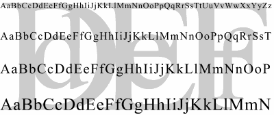
The appearance of these fonts for modern perception is almost ideally neutral. The shapes and proportions of letters, the relative prominence of strokes and serifs, the contrast level---all these features are nearly transparent for the eye, adding minimum, if any, distinctive or "personal" features to a font. In short, transitional design could be a good candidate for a "generic serif font." |

| Fig. 3: Times Roman is the most widely used of all Transitional fonts---and probably even of all existing fonts |
|
It is difficult to name just one reason for this phenomenon. Who
could say, was it that Times was chosen as the basic computer typeface
because of its neutral character, or on the opposite, we perceive it as
neutral because we got used to seeing it everywhere? I think that indeed
it was the transitional period when the best possible balance was
achieved between the freedom and even looseness of Old Style and the
mannered rigidity of the new type of 19th century.
That new, sometimes even called "revolutionary," font design created at the very end of 18th century and dominating throughout the 19th century was, quite naturally, called Modern or New Antiqua. (There are other examples when some intermediate stage in the history of art becomes forever termed "the newest"; for another instance, "art nouveau," which means "new art," was current in late 19th century and then obsoleted by other movements---but kept its name.) This style has further developed some of the transitional trends, but decidedly abandoned some others. |

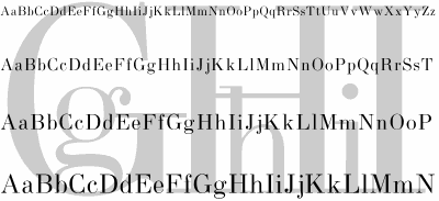
| Fig. 4: Use Modern typefaces to create an old-fashioned look (pun inevitable) |
|
In particular, Modern fonts have drastically increased contrast, leading
this parameter almost to the edge of legibility and technical
feasibility (in fact, one of the inventors of the new style,
Giambattista Bodoni, had to improve the printing machinery he had
available in order to reproduce the new fonts). The long, hairline
serifs and horizontal strokes are the first thing we notice about this
font style, although it has some peculiarities in the shapes of letters
as well.
Due to the high contrast and the lack of almost any coves and rounded corners, the feeling conveyed by Modern fonts is very dry, rigid, elaborate, even unnatural. Although Modern has an easily recognizable style of its own, my opinion is that this font design is a dead end in the history of type, because, in at least one aspect, it has achieved a limit that cannot be pushed any more without losing some essential characteristics of letters. This might be considered truly ironic that the fonts that were once hailed as a revolutionary improvement and called "modern," now are perceived so distinctively obsolete and out-of-fashion. Perhaps that's because this font design was the last to lose dominance, its dislodging took place within our recollection, and we therefore tend to associate it with our direct predecessors, the "parents generation"---which is always divided by a wider generation gap from our own than those who happened to live centuries ago. But maybe the reason is simpler, and the spiral of history has brought us to a point where we're much closer to the harmony and open spirit of Renaissance than to the self-assuredness and mannerism of the 19th century. Despite what I said about the "dead end", Modern has in fact served as a base for several design variations created throughout the 19th century, the most notable being slab serif fonts where serifs were as wide as main strokes or even wider, and later, clarendon fonts that re-introduced cove serifs and lowered contrast while preserving the overall style of Modern letterforms (New Century Schoolbook is the most widely used Clarendon font). Both classic Modern faces and their derivatives have pretty much dominated the typography scene in the 19th---and well into 20th---centuries. However, it didn't take some new and fashionable design style to replace Modern faces in the mass book production. Instead, the century now drawing to a close was marked by an unprecedented wave of revivals---fonts created from ancient prototypes of the Old Style, Transitional, and early Modern ages. It wasn't long ago that the now ubiquitous Times, Baskerville, Garamond, Bodoni were recreated, using a varying degree of generalization and modernization, by our century's font artists from old printouts and printing matrices. Now the spectrum of digitized serif typefaces is wider than ever; dominated by revivals, it also contains a plethora of original faces, for both body text and display setting, combining modern trends with the best features of all previous ages of typography. |
Revised: Feb. 22, 1998
URL: https://www.webreference.com/dlab/9802/serifII.html


 his new type design, belonging to the 18th century, is now
called Transitional because of its intermediate position between
the Old Style and Modern styles (more on the latter below). Here
belong such faces as the ubiquitous Times Roman and Baskerville; their
features include higher level of contrast (vertical strokes are
noticeably thicker than the horizontal ones), mostly vertical stress
(the "O" is symmetric, although lowercase letters, such as "e" in Times,
may still have diagonal stress), and a more linear, austere
design. Serifs in these fonts are not too long, sometimes
pointed, and connected to main strokes through outspoken coves (so the
serifs seem to have a triangular shape).
 Find a programming school near you