The World of Fonts. Sans Serif History
| Sans Serif History |
|
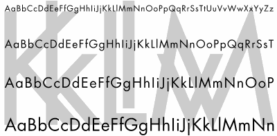
Actually, it is amazing that the simple idea of dropping serifs at the ends of strokes didn't occur to the great many typographers who experimented with their shapes and sizes so much. In part, it is due to the inertia of scribes' tradition who, with their quills, simply could not produce a reasonably clean cut of a stroke. Undoubtedly, old typographers also knew the fact that was later confirmed by experiments: Serifs help the eye to stick to the line and thus facilitate reading. But the biggest part of the serif persistence was, of course, due to plain habit. When the first examples of sans serif fonts finally appeared, they seemed so controversial that the first name given to them was "grotesque," and they were very rarely used except in advertising. And so it remained until the newest trends in art and industrial design, most notably the German Bauhaus movement of 1920s (influenced by earlier Russian constructivism), required adequate means of typographic expression. These movements stressed utilitarian aspects in design, claiming that a thing becomes beautiful only when---and because---it serves a practical purpose, denying any attempts to artificially "adorn" it. The most influential type design of that epoch, the Futura font created in Germany in 1928, displayed the core of the Bauhaus ideology: strictly geometric outline, lacking any embellishments and just barely conforming to the historical shapes of letters. The resulting blend of geometric consistency and aesthetic awkwardness may be disputable, but it was at least something quite new, and therefore impressive, at that time. Now we're much more accustomed to the look of Futura (and its many derivatives), but the inborn radicalism of the font still shows through. |

| Fig. 5: Futura In The Past, or A Triumph of Geometry: developed by Paul Renner in 1928, this font may be called the starting point of sans serif history in our century |

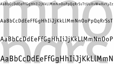
| Fig. 6: Officina Sans is another Meta-like font designed by Spiekermann |
|
Interestingly, the problems that the designer tried to resolve with the
new typeface were purely practical---Spiekermann's goal was to create an
economic font readable in a wide variety of sizes and conditions.
Here's what the designer himself writes in his article:
Meta has been hailed as "the typeface for the nineties"; young
designers seem to appreciate its rugged charm, which owes a lot to the
detailed requirements of small type on bad paper. It was never
designed to be a trendy typeface, rather it was designed to solve
specific problems. Maybe it is that honest, unpretentious
background which appeals to graphic designers and typographers around
the world.
Here's a truly enlightening comparison: Note how the two approaches to a "purely utilitarian" font design, differing only by the fact that one was rather theoretic and the other driven by practical needs, resulted in two fonts as different as Futura and Meta. |
Revised: Feb. 22, 1998
URL: https://www.webreference.com/dlab/9802/sansserif.html


 he first half of 20th century is the end of the Modern era,
the moment when revived typefaces were flooding the typography
mainstream. But it was also the time when a completely different
font design was booming, called sans serif (which is French for
"without serifs"). It wasn't an absolutely new idea at that time,
since first sans serif faces had appeared in the beginning of 19th
century; but never before this seemingly peripheral and exotic trend
claimed so much importance as in 1920s and 30s.
 Find a programming school near you