The World of Fonts. Serif History I
| home / experts / dlab / 9802 |
| Serif History I |
|
During centuries prior to that time, the prevalent style of letterforms was the one now called blackletter, or "Old English" (Fig. 1, top). Complex, whimsical blackletter shapes were difficult to write and read; what's worse, they were absolutely clashing with the ideology of then-burgeoning Renaissance movement and its admiration of classic Roman and Greek art. New, humanist writings required creating a new type of fonts---more secular, more legible, and more elegant. |
 ome treatises on the history of type start from ancient
Egyptians and their hieroglyphs, but I'd rather restrict my article to
those types of fonts that you're likely to encounter in your everyday
work. If we do not take into account some really exotic faces, the
modern history of type begins in the 15th century, when the first
examples of the fonts now called Old Style appeared (I use
initial capitals to differentiate Old Style as a classification term
from other uses of the words).
ome treatises on the history of type start from ancient
Egyptians and their hieroglyphs, but I'd rather restrict my article to
those types of fonts that you're likely to encounter in your everyday
work. If we do not take into account some really exotic faces, the
modern history of type begins in the 15th century, when the first
examples of the fonts now called Old Style appeared (I use
initial capitals to differentiate Old Style as a classification term
from other uses of the words).
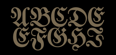
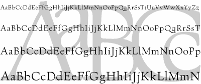
| Fig. 1: The 15th century witnessed probably the most drastic revolution in typeface design |
|
Thus came the first "revival wave", the first time when font artists
looked into the past in order to create better typefaces for the
present. The problem at that time was, however, that ancient
Romans didn't have but uppercase, capital letters. While adopting
their designs for capitals, Renaissance typographers had to spend more
time working on lowercase lettershapes. As a basis, they took
carolingian scripts that were common in early Middle age (before
the blackletter had become dominant style across the Western Europe),
but changed them significantly to match the Roman uppercase letters and
to better adopt to Gutenberg's printing technology (that had just
appeared).
Due to its origin, this new type of fonts was then named Antiqua, i.e. "Ancient." (Later, the term Antiqua was used for all typefaces that appeared after the blackletter era, and the original Antiqua fonts came to be named "Old Style" or "Humanist Antiqua.") Ironically, it is these first Antiqua exemplars (more precisely, their 20th century replicas) that have probably the most up-to-date and fashionable look for modern eye. Enough to name such fonts as Garamond, Minion, Jenson; their light, spruce, stylish outline conveys the unfalsifiably humanist spirit, and these fonts are now very popular for all sorts of design jobs. Formally, the Old Style typefaces are characterized by fairly constant width of all strokes and serifs (typographers say that they have low contrast), complex non-linear shapes of strokes, and so-called "cove" serifs that form curves where they join the main strokes (the ends of serifs are also sometimes rounded). The thick parts of strokes do not necessarily go vertically; look e.g. at "O" or "e" in Village (Fig. 1, bottom), where the thickest parts of the outline are at bottom left and top right. This feature, called diagonal stress, is an attempt to imitate handwriting of the scribes, who held their pens at some less-than-90 angle to the direction of the line. Italic varieties are especially interesting in Old Style fonts. In those times, italic faces had just appeared and were thought of as independent fonts and not as companions to roman faces. Therefore, authors of modern Old Style revivals had to artificially match independent designs, often created by different typographers and in different centuries, to compose a complete font family with roman and italic faces. |
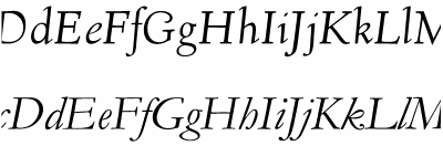
| Fig. 2: Examples of early (top) and late (bottom) Old Style italic faces |
| Early italic faces had a more handwritten look and a small slant, while later, 16th century italics feature more outspoken slant (sometimes capitals are less oblique than lowercase letters) and peculiarly narrowed letterforms. In roman faces, the late Old Style design (of well-known fonts, Garamond belongs to this period) loses its diagonal stress, the contrast of strokes is increased, and strokes become more linear. Overall, all the most peculiar (or at least, peculiar to a modern look) Antiqua features were ironed out with time---by the end of 17th century, a new type of font design was emerging. |
![]()
![]()
![]()
![]()
![]()
Created: Feb. 22, 1998
Revised: Feb. 22, 1998
URL: https://www.webreference.com/dlab/9802/serifI.html
 Find a programming school near you