Page Structuring Using Cascading Style Sheets - Part 2/Page 2
[next] [next]
Page Structuring Using Cascading Style Sheets: Part 2
Designing Tableless Web Pages Using AP Elements
One of the biggest trends in web development is that of designing websites that don't use antiquated tables to control the structure of the site, but instead rely on AP Elements and CSS positioning properties to control the layout and flow of web pages. In the next few sections, you'll learn how Dreamweaver—in conjunction with the <div> tag and a little CSS—can create standards-compliant web designs.
Note: The term given to the process used for handling layout in CSS-based page designs is referred to as CSS-P (P for "positioning"). Technically, AP Elements in Dreamweaver use CSS-P for their positioning. In fact, if you select an AP Element in the Document window, you'll notice that label "CSS-P Element" is shown in the upper-left corner of the Property inspector.
Designing AP Elements Using a Style Sheet
In the previous sections of this chapter, you learned how easy it was to insert AP Elements using either the Insert, Layout Objects, AP Div command or the Draw AP Element option available from the Layout category in the Insert bar. Although these are viable options for designing a site using AP Elements, they aren't the best choice. The reason for this is simple: When you use either of these methods to insert AP Elements on the page, Dreamweaver automatically assigns document-wide CSS positioning properties for each AP Element. As a result, the page becomes inflexible and nearly impossible to modify globally when numerous pages exist within the site.
A better alternative to inserting or drawing AP Elements onto the page is to create an external style sheet (which we already have for our project) and define numerous ID selectors that define the various sections of the page. For instance, we know our site will contain the following major sections based on the design we've been working with up to this point:
- Header—We know we'll have a header that resides near the top of the page. The header will have a width of 100% and a height of 227 pixels. We also know that the header will have a background image that spans the entire width of the browser. Finally, the header will contain the
header.gif image that defines the logo and company name.
- Navigation—Just under the header but to the left of the page, we'll have a simple navigation menu. In this scenario, we can add an AP Element that will serve as a container for the five navigation links. Although the height doesn't matter in this case, we'll want to set the width at 200 pixels.
- Content—The third major section in the page is reserved for the content. This section will reside under the header but just to the right of the navigation area. Because our navigation area has a set width of 200 pixels and we want to keep the entire width of the page to a universally accessible 760 pixels, we'll set the content area's width to 560 pixels (200 pixels + 560 pixels = 760 pixels). Again, because a user will naturally scroll up and down the web page, the height for this section is irrelevant.
|
Now that we've outlined the major sections for our page, let's begin outlining the CSS rules. Because we know we'll have at least three major sections in the page (Header, Navigation, and Content), we can surmise that we'll need at least three CSS rules represented by three unique IDs titled header, nav, and content, respectively. To begin creating these selectors, follow these steps:
- Create a new HTML page by choosing File, New. When the New Document dialog appears, select the HTML option from the Basic Page category, choose the
<none> option from the Layout list, and click Create. Immediately save the page as index.html.
- Attach the existing
styles.css style sheet by opening the CSS Style panel, selecting the Attach Style Sheet icon, browsing for the styles.css file, and clicking OK.
- Create a new CSS rule by clicking the New CSS Rule button in the CSS Styles panel. The New CSS Rule dialog appears.
- Choose the Selector Type: Advanced option and enter the name #Header into the Selector text box. Remember that the pound symbol represents ID (thus, the ID selector name is Header). When you finish making your modifications, the dialog should resemble Figure 7.11.
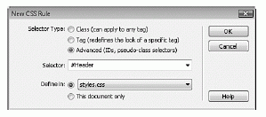
Figure 7.11 Create a new selector ID called Header.
- Click OK. You're now ready to start defining the properties that will make up the Header rule and ultimately define the Header AP Element at the top of the page.
- Switch over to the Positioning category. Set the property for Type to absolute, the width to 100%, the height to 227 pixels, the Visibility to Visible, and Top and Left Placement properties to 0. When you finish, the Positioning screen resembles Figure 7.12.
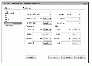
Figure 7.12 Modify the Positioning attributes for the Header rule.
- Set the background image that will appear within the Header AP Element. You can do this by switching to the Background category. Browse to the header_bg.gif file from the Background Image field. Finally, choose the Repeat-x option from the Repeat menu to guarantee that the background image will tile only horizontally and never vertically.
- Click OK. The new ID appears in the CSS Styles panel and styles.css is automatically opened in a new tab behind your current document.
|
That's it! You're now ready to define the style rules for the remaining AP Elements. To define the Nav rule, follow these steps:
- Create a new CSS rule by clicking the New CSS Rule button in the CSS Styles panel. The New CSS Rule dialog appears.
- Choose Selector Type: Advanced, if necessary, and enter the name #Nav into the Selector text box.
- Click OK. You're now ready to start defining the properties that will make up the Nav rule and ultimately define the navigation AP Element.
- Switch over to the Positioning category. Set the property for Type to absolute, the Width to 190 pixels (we'll add a padding of 10 pixels to the left of this AP Element shortly), the Visibility to visible, the Top Placement property to 227, and the Left Placement property to 0. When you finish, the screen should resemble Figure 7.13.
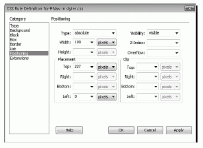
Figure 7.13 Modify the Positioning attributes for the Nav rule.
- So that our navigation items don't run up against the left edge of the browser window, let's add some padding to this style rule. To do this, switch to the Box category. Disable the Same For All check box in the Padding category and enter a value of 10 pixels for the Left property.
- Click OK. The new ID appears in the CSS Styles panel.
|
To finish up the design, let's define the Content style rule:
- Create a new CSS rule by clicking the New CSS Rule icon in the CSS Styles panel. The New CSS Rule dialog appears.
- Choose Selector Type: Advanced, if necessary, and enter the name #Content into the Selector text box.
- Click OK. You're now ready to start defining the properties that will make up the Content rule and ultimately define the content AP Element.
- Switch over to the Positioning category. Set the property for Type to absolute, the Width to 560 pixels, the Visibility to visible, the Top Placement property to 227, and the Left Placement property to 200.
- Click OK. The new ID appears within the CSS Styles panel.
|
Now that we've outlined the properties for the three major sections of the site, we're ready to insert the tags that will act as containers for the content. The properties we've outlined will serve as the formatting and positioning attributes for the <div> tags we'll add next.
[next] [next]
URL:


 Find a programming school near you