Making Headlines With CSS (6/7)
[previous] [next] |
Making Headlines With Cascading Style Sheets
Image is Everything
Then there are times when you wish to incorporate an image into your designs. Thanks
to the background property in CSS, you can include images in every block level
element! You don't have to build a huge background image and tuck it into your pages
through the body element.
Either you think your page needs help in attracting the wandering eyeballs of your visitors or the client wants that something special. In the next few examples, we will cover three headline examples that use a JPG, a GIF, and a PNG.
Example #12

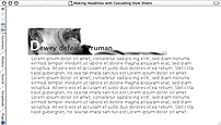
This first example just makes use of an image. Since the image isn't cropped exactly
how I want, I'll be using background-position to move it. Also, in order to
get the first letter in the headline to standout, I'm going to use the pseudo-element,
h2:first-letter, in order to increase the size and change its color.
h2	{
	margin-bottom: 0;
	padding: 2em .5em .5em .5em;
	background-image: url(examples.jpg);
	background-position: -20px -80px;
	background-repeat: no-repeat;
	color: #333;
}
h2:first-letter
{
	color: #fff;
	font-size: 200%;
}
p
{
	margin-top: 0;
	color: #333;
	padding: .25em 0 0 .75em;
}
For a live example, take a look at Headline 12.
Example #13

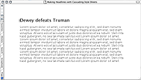
Before Flash took the Web by storm, Web builders actually used GIFs to create animations for the Web pages. (Yes, it's shocking but true!) And thanks to CSS, you can put animated GIFs behind headlines like I do here.
First, here's the animated GIF:

Next up is the CSS:
h2
{
	margin-bottom: 0;
	padding: 0 .5em .5em .5em;
	background-image: url(animgifheader.gif);
	background-position: -20px -15px;
	background-repeat: no-repeat;
	color: #333;
}
p
{
	margin-top: 0;
	color: #333;
	padding: .25em 0 0 .75em;
}
For a live example, take a look at Headline 13.
In this example, I simply took a screen capture of the text and the blurred sections of the text to create the animation. However, you could create Monty Python-esque animations or have simple, but annoying, rapid color changes. It's all up to you.
[previous] [next] |
Created: December 11, 2002
Revised: December 11, 2002
URL: https://webreference.com/authoring/style/sheets/headlines/6.html


 Find a programming school near you