3D Animation Workshop: Lesson 20: Metal and Mirrors | 2
|
|
Lesson 20 - Metal and Mirrors - Part 2
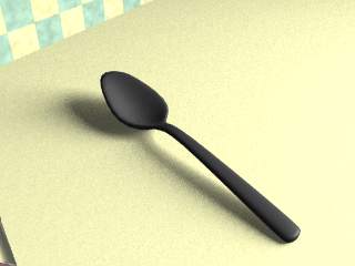
Let's strip away both the specularity and the reflectivity from our original spoon and see what happens.

This sure looks dark! But it reveals a fundamental fact of metal surfaces, and one well understood by realistic painters. Metallic surfaces are surprisingly dark where they are not reflecting, or rather, the contrast between brilliant reflection and much darker diffuse color surface is the characteristic look of metal.
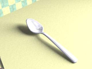
Compare what happens when we bring up the diffuse color to a light gray, closer to what we might naturally think of as the "color" of silver.

This certainly seems like a better place to start, but note what happens when we add back the specularity and reflectivity.

That's a pretty polished piece of silver! The underlying diffuse color is so light, that after the reflections are piled on it appears almost white. Compare this to our original surface (with the dark diffuse color base) to understand the difference clearly.

The darker color is more esthetically appropriate to our scene, but even in the right context, the brighter surface is too washed out. We've faced this issue before with respect to shadows and shading on objects. 3-D effect is greatly enhanced by gradations in shade, and where the diffuse color of an object is very dark, there is little room for a revealing palette of grays. With reflection (both specularity and true reflection) we find the same issue in reverse. If the underlying diffuse color of an object is very light, highlights and reflections are not so striking in contrast.
To isolate the effect of specularity, let's strip out the reflectivity.

Specularity obviously doesn't contribute very much to the metallic effect, in this case only the little highlight at the end of the handle. We could probably do without it altogether in this instance and get away with it. It's often wise to completely eliminate surfacing parameters that have only negligible effect. If surface concepts are kept as simple as possible, they are easier to edit and adapt for other purposes. All applications permit the artist to build libraries of surfaces (often called "materials" or "shaders"), and a strong collection is an important capital asset. Keeping your surfaces as simple as possible (consistent with your needs) will provide the most utility as you further develop your library. For example, the essential metallic parameters can be used to build chrome, or gold or copper surfaces.
Let's get on to the meat of this surface--reflectivity.
| To Continue to Part 3, or Return to Part 1, Use Arrow Buttons |
|
Created: September 9, 1997
Revised: September 9, 1997
URL: https://webreference.com/3d/lesson20/part2.html


 Find a programming school near you