3D Animation Workshop: Lesson 17: Photorealism 101 | 3
|
|
Lesson 17 - Photorealism 101 - Part 3
How important are shadows in selling reality?
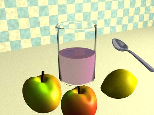
Let's take them out and see.

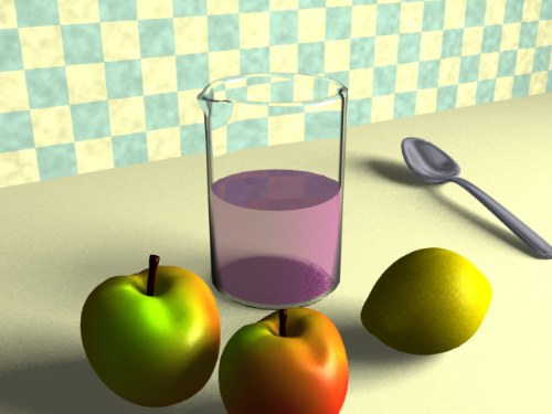
Compare this to the original image to really understand the difference. I apologize for the scrolling required, but these images become hard to analyze when rendered any smaller.

The most striking aspect of this shadowless world is that the objects no longer appear to be sitting on the table. They seem to be pasted on top of the scene, just as 2-D bitmaps are composited in Photoshop. The bottom of the beaker simply disappears, which is even worse than merely floating.
The shadows, therefore, establish that the objects are in contact with the table. In the case of the spoon, the shadow comes right up to kiss the contact points with the table. With the fruit, the shadowed portions of the objects themselves blend directly into the shadows on the counter. And in the case of the beaker, the shadow reveals the contact between the flat, transparent bottom surface of the object and the table. Notice that, in this case, we are seeing the object's shadow through the transparent object itself. The beaker is also casting a very vague shadow across the counter. This is another critical clue that a transparent object is nonetheless interacting with light.
Notice the difference between shadows and shading on the objects themselves. Only the shadows have been eliminated--that is, the effect that the objects have in blocking the light. Even without these shadows, the fruit objects are shaded. The right sides of these objects are facing the light and are therefore much brighter than the right sides. Shading is a basic element of the rendering process in which the brightness of a pixel representing the surface of an object is determined by its orientation toward a light source. Shadows, however, are a much more sophisticated aspect of rendering because the interaction of separate objects must be considered. We'll be spending a good deal of time on shadow casting as we go along.
Shadows must be contrasted with reflection. Let's make the surface of the counter slightly reflective and see what happens.

Examine the differences between the shadows and the reflections. The reflections carry some color, as can be seen most clearly in the slight reflection of the checkerboard pattern from the wall. They are also oriented with respect to the viewer, rather than to the light source. The shadows fall away to the left because the light source is evidently to the right. But the reflections rest in front of the objects because this is the path between the camera viewpoint and the objects.
The reflections provide more visual clues to support the viewer's belief in the scene, but do they improve the image? Of course, if our purpose is to present a scene in which the counter is a reflective surface, so be it. But if this is not a requirement, does the additional visual data detract from the scene? Do the reflections distract the viewer's attention from the fruit and beaker? These are very important questions to address from the very start. 3-D graphic tools can provide so much visual information that the artist is tempted to overuse them to the possible detriment of both the esthetics and perceived realism of the scene.
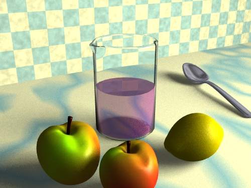
Consider the same issue in another way. In the following render, the surface of the table is given a marble pattern using a procedural texture. The reflections are gone.

The counter top is, perhaps, more interesting this way, though the setting now feels closer to a bathroom than a kitchen, and the purple liquid seems more like mouthwash. The pattern gives the viewer more visual information. It is visible through the liquid, confirming the sense of transparency. And the abutment of the contrasting pattern against the wall sharpens the sense of both surfaces.
But is this an improvement? Does the additional color in the counter devalue the objects, especially the apples. And does the pattern distract from and confuse the shadows cast by those objects?
Questions like these are for each artist to answer for himself or herself. My point is only that the sense of realism and pleasure can be eroded by an excess of visual information.
We'll start digging into the details next week.
| To Return to Parts 1 and 2, Use Arrow Buttons |
|
Created: August 19, 1997
Revised: August 19, 1997
URL: https://webreference.com/3d/lesson17/part3.html


 Find a programming school near you