How to Use Advanced Windows Forms | 3
How to Use Advanced Windows Forms

18.2.2 The TreeView class
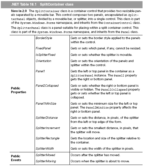
The SplitContainer class is great for dividing a form or other container into two
parts. The next question, of course, is what to place in each part. One of the more
common controls for the left side of a split form is the TreeView control.
One of the better-known examples of the TreeView control is the Windows
Explorer interface, where the Folders view provides a tree of the devices, folders, network
locations, and other information about the local computer environment. The
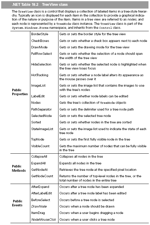
Windows Forms TreeView class supports this functionality, and is summarized in
.NET Table 18.2.
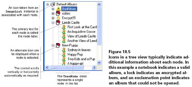
Each item in a tree view is called a tree node, or just a node. Tree nodes can contain
additional nodes, called child nodes, to arbitrary levels in order to represent a hierarchy
of objects in a single tree. Tree nodes at the top level of a tree view control are
called root nodes. Figure 18.5 shows some of concepts and classes used with the Windows
Forms TreeView control.
The members in .NET Table 18.2 are just some of the members defined by the
TreeView class explicitly. As you can see, members are provided to manage the
nodes in the tree, including the selection, drawing, and contents of each node. We
use many of these members as we build our sample explorer application.
A short summary of some members not mentioned in .NET Table 18.2 is probably
worthwhile. The nodes in the tree can be sorted alphabetically by setting the
Sorted property to true, or a custom IComparer interface can be assigned to the
TreeViewNodeSorter property to specify a custom sort for the nodes.
An additional set of properties defines how the nodes in the tree are laid out. The
Indent property indicates how many pixels to indent each level in the tree, while the
color, existence, and appearance of lines between nodes are affected by the Line-
Color, ShowLines, ShowPlusMinus, and ShowRootLines properties.
As shown in figure 17.5, each node in a tree view can display an icon next to the
node label. The ImageList property defines the images to use for this purpose.


Other image properties include the ImageIndex property to indicate the index of
the default image and the SelectedImageIndex property to indicate the index of
the default image for a selected node. The default images can alternately be specified
by image name, using the ImageKey and SelectedImageKey properties, which we
demonstrate in the next section.
A second set of images can also be displayed to represent the state of each node.
The images for the state icons are defined by the StateImageList property. When
the CheckBoxes property is true and state images are defined, the first two images
in the StateImageList collection are used to indicate the unchecked and checked
state, respectively.
One other set of members we should probably highlight consists of the After and Before events. A few of these are shown in .NET Table 18.2, but be aware that
before and after events occur when a user clicks on node check boxes, expands or collapses
nodes, edits node labels, or selects nodes.
Created: March 27, 2003
Revised: May 1, 2006
URL: https://webreference.com/programming/winforms/1


 Find a programming school near you