ThinWire Handbook: Layout Management | Page 4
[previous]
ThinWire Handbook: Layout Management
Use TableLayout Like a GridBox
As we were implementing the TableLayout, the thought occurred that conceptually a table could be considered the same as a grid. In Chapter 2, "Component Overview," we introduced our GridBox Component that allows data to be displayed and manipulated in a grid. Wouldn't it be cool if the TableLayout also implemented the same interface as the GridBox? We certainly thought so.
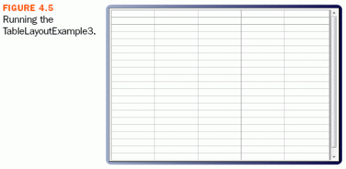
The Grid API takes the TableLayout to a whole new level. The definition of the layout itself is now dynamic. Rows and Columns can be added and removed at any point in your application (see Figure 4.5). Components can be referenced directly by their location in the Grid. And we decided to add some gravy by allowing you to toggle the visibility of Rows and Columns and have the layouts adjust to fill in the gaps (see Listing 4.5).
LISTING 4.5 The Editable GridBox

One of the most requested features is the ability to type directly into the cells in a GridBox. Although the GridBox Component does not currently support this, we can create a reasonable facsimile using a Panel, many TextFields, and TableLayout. The API is identical to the GridBox with one exception. TableLayout.Rows and TableLayout.Columns need a size specified to their constructors.
Custom Layout Manager
Although TableLayout should be able to handle any layout task you can throw at it, you might have a desire to create your own layout manager. If the mood should strike you, we have provided a default implementation of most of the methods in the abstract class AbstractLayout. As an example, we walk you through the process of creating a simple flow layout.
First we create a new class that extends AbstractLayout. A flow layout arranges Components in a directional flow, much like lines of text in a paragraph. The FlowLayout included with Swing allows for many configurations. For simplicity, our FlowLayout arranges Components left-to-right and aligns them along the top (see Listing 4.6).
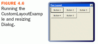
Every layout manager must implement its own apply method. This is where all the positioning work is done (see Figure 4.6).
LISTING 4.6 Custom Flow Layout

Notice that we make use of some member variables: container, margin, and spacing. These are defined in AbstractLayout as protected members.
For convenience, we have the constructor take the margin and spacing as parameters. Using the setter methods rather than the properties directly allow us to take advantage of some range checking. What's important about the constructor is the call to setAutoApply(true). By calling this method and passing it true, we're instructing AbstractLayout to call the apply method any time the dimensions of the Container change, a Component is added or removed, margin is changed, or spacing is changed. Everything required to make this layout dynamically applied is taken care of by setAutoApply(true).
Summary
ThinWire is all about making the developer's life easier, and layout managers provide the means to quickly get an application "all laid out like that." TableLayout should take care of 90 percent of your layout needs. For the other 10 percent, we have SplitLayout and the AbstractLayout (which implements all the common features and allows the developer to quickly create a new layout).
We're getting closer to completeness in our discussion of ThinWire. You know how easy it can be to create very complex and interactive applications. The next chapter shows you how to customize the look of the Components and your application as a whole.

This chapter is excerpted from ThinWire Handbook: A Guide to Creating Effective Ajax Applications (Digital Short Cut), authored by Joshua Gertzen and Ted C. Howard, published by Prentice Hall, © Copyright 2007 Prentice Hall. All rights reserved.
[previous]
URL:


 Digg This
 Find a programming school near you