ThinWire Handbook: Layout Management | Page 2
[previous] [next]
ThinWire Handbook: Layout Management
SplitLayout
The simplest layout manager in the framework is SplitLayout. SplitLayout divides a Container into two sections, placing one Component on each side. SplitLayout provides a draggable divider, allowing the user to adjust the split. The split can be either vertical (splitting the Components left and right) or horizontal (splitting the Components top and bottom). Example time (see Listing 4.1A).
LISTING 4.1A Create a TabSheet with Two Buttons Split Evenly
SplitLayout Only Works with Two ComponentsSplitLayout works with exactly two Components. No more, no less. May God help you if you decide it would be funny to add a third Component. Boy, you are playing with fire!
A Layout is associated to a Container via the setLayout method on Container. Only one Layout may be assigned to each Container, and a Layout can only be assigned to one Container. The preceding code uses the simplest constructor for SplitLayout. The one parameter is a double value that defines the size of the first Component in the Container. If the value is greater than 1 (a whole number), it represents the size in pixels. If the value is less than 1 (a decimal), it represents a percentage of the available space. In this example, .5 stands for 50 percent of the available space; therefore, the two Buttons split the Container evenly.
Notice how one Button is on top, and the other is on bottom. This is called a horizontal split. If we want a vertical split, we set the splitVertical property to true or use the two-parameter constructor (see Listing 4.1B).
LISTING 4.1B Create a TabSheet with Two Buttons Split Vertically
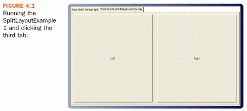
Now we have a Panel with two Buttons split evenly and vertically (see Figure 4.1). What more could we want? Let's try changing the margin and spacing. How about a 10-pixel margin around the edge of the Panel and a 20-pixel space between the Buttons (see Listing 4.1C)?
Default Spacing for SplitLayout Whereas in most cases you would expect the initial margin and spacing for a layout to be 0, the spacing is set to 4 by default for SplitLayout.
LISTING 4.1C SplitLayout with a 10px Margin and 20px Spacing

Isn't it beautiful? Plus, if the Panel's dimensions change, so do the Buttons. SplitLayout will keep them in proportion.
Another feature of the SplitLayout is the ability to maximize one of the Components. This is accomplished with the setMaximize(Maximize) method. This method takes an enum constant that identifies whether the first or second Component is to be maximized. The options are NONE, FIRST, or SECOND. When a Component is set to be maximized, its previous state is preserved. Simply pass NONE to setMaximized to restore this state.
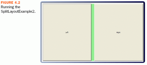
The only other thing you might possibly want with this layout is to make the spacer more visible. To accomplish this, we use the getSpacerStyle method, which returns a Style object. We cover the Style API in the next chapter, so just take our word that the code in Listing 4.2 will give you a green spacer (see Figure 4.2).
LISTING 4.2 SplitLayout with Maximize and Green Spacer

[previous] [next]
URL:


 Find a programming school near you