When Boxes Have Little Boxes of their Own - Boxing with CSS, Part I: The Theory - HTML with Style

Boxing with CSS, Part I: The Theory
When Boxes Have Little Boxes of their Own
We know that every block-level element creates a box. As I said in the previous page, at the center of every box is an element's content. If the element contains inline elements, then these are displayed within this area. If it contains other block-level elements, the element's content box becomes a containing block for the boxes of its child elements.
So, to display an HTML document, a browser does this: It creates a
box for the BODY element and puts it in the containing
block that is the viewport. The content area of this box (inside the
margin, border, and padding) is the containing block of all the block
elements that are inside the BODY element. These get
placed one under the other. If any of these elements have block-level
children of their own, these are placed within the content of their
parent elements, and so on until there are no more block elements to
be displayed.
To illustrate this, here is an example. We have a
BODY element that contains a DIV element
and a paragraph. The DIV element itself contains another
two paragraphs. So the document body will look something like this:
<BODY>
 <DIV>
  <P>
Contents of first paragraph.
  </P>
  <P>
Contents of second paragraph.
  </P>
 </DIV>
 <P>
Contents of second paragraph.
 </P>
</BODY>
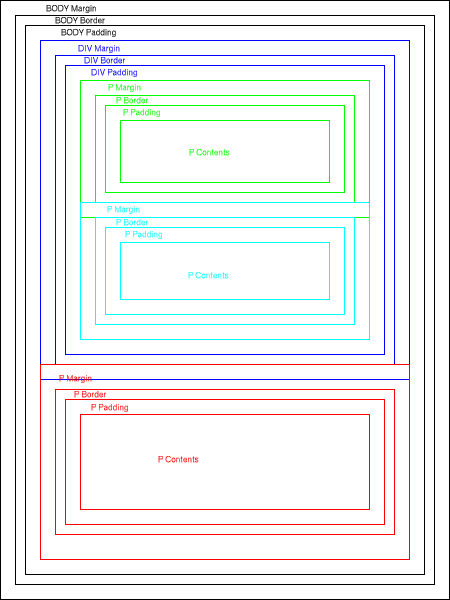
This will be displayed as shown in figure 6.

Figure 6: A Simple Layout
Notice how the margins of the first two paragraphs, which are
equal, collapse, as do the margins of the DIV and the
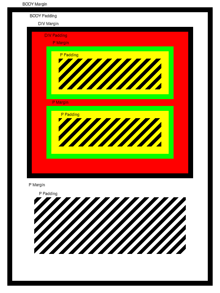
second paragraph. Now let's assume that the body has a black border
and a white background, that the DIV has a black border
and a red background, that its children paragraphs have a green border
and yellow background, and that the third paragraph has no border and
a transparent background. The result will be something like the
following:

Figure 7: A Simple Layout Revisited
The black stripes in figure 7 stand for the actual content of the paragraphs. Although you'd probably never design anything looking quite like that document unless you're in the biohazard warning sign business, figure 7 serves to show what is possible with even this small subset of the capabilities of the CSS visual formatting model. But in order to achieve all of this formatting, you need to use the correct properties.
Produced by Stephanos Piperoglou
All Rights Reserved. Legal Notices.
URL: https://www.webreference.com/html//
Created: Nov 18, 1998
Revised: Nov 18, 1998


 Find a programming school near you