Graphic Greats: Production Graphics with Wendy Peck at webreference.com | 40
 |
Lynda Weinman on Design | |
|
Lynda.com. Many new features and a flood of new traffic. |
Wendy: You have a lot of new features on your Web site, Lynda.com, including interactive features. How has this affected your traffic? Lynda: It's affected it greatly and in a positive way. We now have over 1 million independent visitors per month. Before we added the new areas to our site, we had about 80,000 visitors per month. For those readers who aren't familiar with the interactive features you are alluding to, we now offer tips, discussions, a jobs board, a store, and polls. We don't offer ad banners, so those numbers don't bring us direct revenue, but our sales have steadily increased ever since we started lynda.com. |
|
|
There are too many rectangular graphics on the Webeverything on the Web comes in rectangular packages without one realizing it the Web browser itself, tables, frames, images. |
Wendy: In the thousands of Web sites you have seen, and with all your teaching experience, what are the common mistakes that Web designers make? Lynda: I still see a lot of people making unnecessarily large images, or not compressing graphics with the right format. There are still lots of fringes around transparent graphics, and images that are too large, causing unnecessary page scrolling. Animation and Flash can be easily abused with way too much stuff going on and not enough focus on content. A lot of people don't put their type in tables, so the width of their type columns goes from screen edge to screen edge and is difficult to read. The list goes on and on, but on a positive note, I do see more and more excellent sites as the Web matures. |
|
|
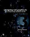
Designing Web Graphics 3, one of the many design books Lynda has written. Available at Lynda.com |
Wendy: Do you have any general tips that would improve almost any designer's work? Lynda: Make a list of the top three things you want your site to communicate and make sure that the design supports those goals. The most common mistake I see is a lack of communication hierarchy. There's a great book on this subject, called Web Navigation by Jennifer Flemming. This book really helps you get your priorities in check. My books and work will help you develop design strategies to make those priority items stand out. You can use all kinds of visual devices, such as color, type, layout, and scale to make things stand out and recede in importance. There are too many rectangular graphics on the Webeverything on the Web comes in rectangular packages without one realizing it the Web browser itself, tables, frames, images. I enjoyed your last column on roughing up edges of graphics (Rough it Up). Techniques like those you described really help developers break out of that boring and confining rectangular box. |
|
|
|
|
|
|
I don't have time to design anymore, and I really think my strongest point in this industry is as a teacher, not a designer. |
Wendy: Do you design Web sites (other than your own)? Lynda: I have never created a Web site other than our own. I
got out of the design and animation business when I had my daughter
in 1989, way before the Web explosion happened, and went into teaching.
I originally built my Web site as a resource for my students when I
was teaching at Art Center College of Design. I never dreamed it would
grow up to have thousands of pages and millions of visitors from all
over the world. It's been quite a journey so far! I don't have time
to design anymore, and I really think my strongest point in this industry
is as a teacher, not a designer. |
|
|
|
Graphic Greats IndexLynda Weinman Start |
URL: https://www.webreference.com/graphics/
Created: Mar. 22, 2000
Revised: Mar. 22, 2000


 Web
Navigation, by Jennifer Flemming, recommended by Lynda.
 Find a programming school near you