Graphic Greats: Production Graphics with Wendy Peck at webreference.com | 25
 |
Graphic Greats: Navigation Graphics |
|
|
I usually follow a tutorial with a Greats tour on the same subject. However, since the last two tutorials have been on masks, I am going to pass on this subject. It is too hard to tell what method has been used for a graphic when you only see the completed product. I am going to focus on navigation, since a designer cannot study that too much. Specifically, I went searching for graphic navigation systems, and am quite delighted with the sites I found to bring back to you. Reminder: You will not "like" every site, and occasionally the code on a site I feature here will be less than perfect. Remember, though that we focus on graphics here simply to stretch our design minds. I hope you can take the good from the Greats and continue to strive for excellence yourself in code, design and communication. And with that ... let's get to the goods ... navigation graphics. |
||
|
|
||
|
The suggestion of buttons helps to define the navigation without detracting from the design.
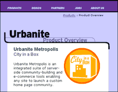
On the interior pages the same effect is accomplished with lines so that the menu takes up very little space.
Site designed by James Tucker of Thunk Designs. |
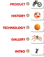
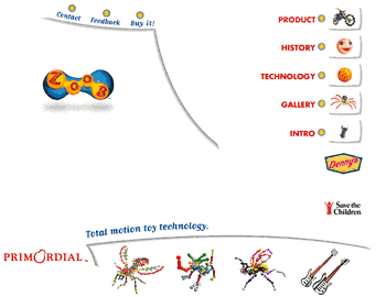
Zoob This site, which describes, markets and sells a child's building toy was so effective I was tempted to order a set and my "baby" is 16. The site is so easy to move around, and the graphics are so compelling that it is hard not to follow them to at least one more page. The menus feature icons that look like they were built from the Zoob pieces and are set off with the suggestion of a button, or a shadowed cutaway. Although the graphics show up well here, this site deserves a visit. Pay attention to how easy it is to move around from any spot within the site. Great work.
Front page of the Zoob site shown here. Note how the strokes hold the navigation icons in good order, yet allows a very freeform feeling for the page. |
|
|
|
||
|
|
Digital Spark The icons are all different in subject, color and visual weight, but the common colored background and outline tie them all together. The curved page division is eye catching in a square Web world (see Lynda Weinman's comments about adding curves in a recent interview). Although the style and color are here, note how all the text appears on white perfect balance between art and function. |
|
|
|
||
|
|
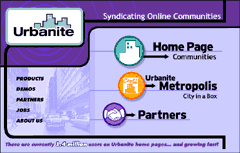
Urbanite
|
|
|
|
Graphic Greats IndexNavigation Graphics Start/Graphic Direction |
|
URL: https://www.webreference.com/graphics/
Created: Apr. 20, 2000
Revised: Apr. 20, 2000


 There
is also a text based sub-menu shown here. I really like the way the
text works with the photo behind. This is an idea worth imitating, since
the text is invitingly plain and very legible, but the photo background
really adds an artistic touch.
 Find a programming school near you