Graphic Greats: Production Graphics with Wendy Peck at webreference.com | 26
 |
Graphic Greats: Navigation GraphicsLarge Menus | |
|
|
MyComputer.com In the lower image shown here (close-up view of listings), how the icon as well as the layout helps to direct the reader to the important places on this page. If you find that your clients require great numbers of navigational items, you should look to this site as an example of superb information presentation. |
|
|
|
||
|
This entry page covers a very wide range of information in an easy to follow pattern.
Close-up of the circular menu shows some interesting graphic touches, from slight dropped shadows (helps to bring text up from a striped background) to a shaped photo and two menu choices outside the boundaries. |
www.com www.com has several customer groups. It is an Internet broadcasting site first and foremost, providing a multitude of musical choices from hard rock, to alternative, to Christian music. In addition, a large part of the site addresses business to business topics, since Web developers can provide this service on their own sites. The style chosen is perfect. It is not too conservative, since this is music after all, yet it is not too funky, which could pull the serious business development into question. The navigation is actually spread throughout the page, but the major topics are all covered in the circle at the top left of the page. Through the circle, you can get to the music, find out about music news or get more information about including the service on your site. Quite brilliantly laid out, with color nicely separating the four main sections. Also note the Log On and Tune In options on the outside edge of the menu circle.(While you are at this site, check out the variety of music available ... they certainly have most genres covered.) Very well done just thinking about how they got it all to work makes my head hurt a little. |
|
|
|
||
|
|
Search
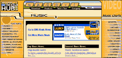
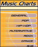
by Media Warning: If you are going to go to this site, it is quite noisy. Normally I am not a big fan of noise on the Web, but you must stop to think of the target audience for this site ... I suspect this group would be quite at home with the popping sound effects and blaring music. Just be warned before you go. Make sure that you pay attention to how much information is listed here, including ads, menu items, news, etc. It is very impressive by any standard. Although the entry page is full, I would not call it overwhelming very well done. |
|
|
|
Graphic Greats IndexNavigation Graphics Start/Graphic Direction |
|
URL: https://www.webreference.com/graphics/
Created: Apr. 20, 2000
Revised: Apr. 20, 2000






 Find a programming school near you