Graphic Greats: Production Graphics with Wendy Peck at webreference.com | 21
 |
Graphic Greats 2: Lines for Design | |
|
Lines in many versions present a very attractive and well designed look. Images © Jorge Hurtato. |
Hurtado Internet Gallery This site is a wonder of line use. Jorge Hurtado has used light lines, curved lines, dotted lines. And that is just as an appetizer. You will also see lines formed with triangles, graduated shade banding as lines, shaded lines. You really must see the full site to appreciate how much of this wonderful design is dependent on lines. The real brilliance of the site is how well it all blends, giving a relaxing feeling to the viewer. It is only when you start to analyze what forms the graphic look that you begin to appreciate the creative skill behind the work. This is a must-see site if you are interested in improving your design skills. |
|
|
|
||
|
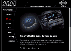
Elegance in simplicity could have been the theme for this site. I have rarely seen so little detail deliver so much impact. Image © Nissan. |
Nissan
Maxima |
|
|
|
||
|
Black and white with a splash of color here and there. Wonderful use of lines and superb navigation.
Interior page sub-menu. Each page has different colored bullets to let you know where you are. Images © Aquent. |
Aquent Simple lines make up a theme that anyone who has worked in the print industry will recognize crop and registration marks set the edges of the page information. Note the bright yellow line of dots and the repeated yellow for the arrows on the sub-menu. All very simple but dramatic and artistic. The second sample shown here is an actual size clip of the the sub-menu on interior pages. Note how the lines are tying the main menu into the sub-menu, as well as defining both the menu and the individual entries. Each page has a different sub-menu represented by a different color easy to tell where you are. This site is well designed with superior navigation. I recommend that you go to the site and wander through the pages, noticing how consistent the look is, yet how each page is different. Great stuff! |
|
|
|
Graphic Greats IndexDesign Lines Start/Lines with Masks Tutorial |
|

 If
you look at the close-up view, you will get an idea of the subtlety
of the lines. You will have to visit the site, though for the full impact
and you should. You will not find a better example of quiet lines
directing the navigation and flow of a page.
If
you look at the close-up view, you will get an idea of the subtlety
of the lines. You will have to visit the site, though for the full impact
and you should. You will not find a better example of quiet lines
directing the navigation and flow of a page.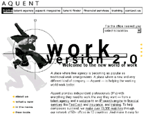

URL: https://www.webreference.com/graphics/
Created: Apr. 5, 2000
Revised: Apr. 5, 2000
 Find a programming school near you