Graphic Greats: Production Graphics with Wendy Peck at webreference.com | 11
 |
Graphic Greats 2: Color for Impact | |
|
Creative color and font use creates a page that is easy to read, yet exciting and lively. Enron. |
Enron Varied font faces and sizes help to direct the reader to important information. Add the power of well-placed color, and the designer truly takes control of the page. The Enron intro page shown here is a very good example of easily available information. A visitor can quickly scan the page and know exactly what is offered. Varied font sizes add a lot of movement to the page and help with the organization. Note the script font used at the lower center of the page, enforcing the Why, which appears in a heavy font in the same column. |
|
|
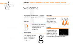
Creative font placement and spots of color are used to form a readable and exciting page. CounterSpace by Studio Motiv. |
CounterSpace
The designer has used only black, gray and orange, but it feels colorful. The logo is created with two different fonts. Note that the word space is spelled out twice, once horizontally with two colors, and once vertically using the same color to create the characters. (Instructions for creating this effect with most graphics programs is in the Text as Design tutorial.) The interior pages are beautifully arranged. Colored lines and large fonts direct the eye to the information easily. This style fits very well into a commercial site, providing the necessary direction and information, while projecting a lively image.
|
|
|
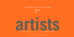
When carefully designed, absolute simplicity creates a powerful presence. Design by State of Agenda and production by Rewire. © Luhring Augustine Gallery. Used with permission. |
Luhring Augustine Gallery This is another Flash page, but not an animated movie. The menu words are revealed when the mouse passes over any of 5 tiny squares just above where the word artist appears. I have included this site as an example of how powerful simplicity can be. Although the major focus for the page is a simple word, it has a carefully designed feel to it. And careful design is necessary for simplicity. Make sure you see this site in action. The menu words are all different sizes and provide even more interest as you move your mouse from one square to another. |
|
|
|
Graphic Greats IndexGraphic Greats Start |
URL: https://www.webreference.com/graphics/
Created: Feb. 23, 2000
Revised: Feb. 23, 2000


 Find a programming school near you