That Darned Content 2 pg 2: Production Graphics with Wendy Peck at webreference.com
 |
That Darned Content 2: Finding the Balance | |
|
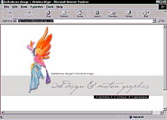
Belladonnadesign.com entry page. At first glance, you might think this is just a pretty splash page, but it is not. The menu linking the whole site, or, the three other pages is right there. |
I guess I must get the prolific clients. I have not run into the problem of not enough content with my clients, and goodness knows, on my own sites, I have a hard time stopping my fingers from clicking away ad nauseum. However, I did receive requests to look at this issue, which means it can be a problem. In fact, when I examined the sites I work on as a whole, there are often a couple of pages that perform a function, but require little content. Before this discussion comes out completely as how to fix a "problem," I would like to show you one site that does a beautiful job of communicating with almost no content. Belladonnadesign.com is a Web designer's site. It is four pages long, and two pages will not require that you scroll vertically to see the entire page. However, take a trip to the site and see if Christine Kilger, company owner and site designer has said what she needs to say. I think you will agree that she has. (Pssst ... a hint! Make sure you browse through Christine's portfolio for examples of wonderful ways to present content.) |
|
|
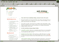
Full page content is balanced.
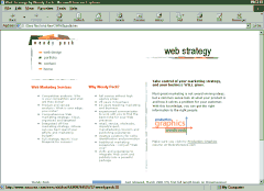
This page lists heavily to the left because the empty right side does not have enough weight to balance the left side of the page.
There is never a perfect way to solve every empty page problem, but usually shuffling content will help. On all the other pages of my site, the left content runs in a long column. Here I have created two shorter columns for the "sidebar," and moved the rest of the content into different columns. While the layout is very different from other pages, it still contains the important design elements. |
Balance and weight Basic design principles come into play more with little content. A page full of content "weighs" more than a single paragraph. If your site has been designed to be balanced with a full page of content, reducing the amount of weight in the content area will upset the balance. Take a look at the samples from my own site that I have included at the left. These shots were taken at 1024 wide resolution. The top sample, the way the page does appear on my site, is quite balanced. If you squint your eyes until you lose all detail (not that there is a lot of detail in these tiny shots), you should see a relatively balanced blur. However, in the second example, where I have reduced the content to one small paragraph, the left side is considerably heavier than the right side. The white that has replaced the "gray" of the text does not visually weigh as much as the content at the left of the page. I balance pages by instinct as much as any other way. If I feel my head tipping one way or the other as I view a page, I go looking for a lack of balance. Squinting at your page, as described above, is a great way to test balance. When you remove the detail from your eyes, it is easier to concentrate on the color blocks (text usually forms a gray color block) and determine if the areas on the page are balanced. Another sure-fire way to test a page for balance is to stand back from your computer. I am fortunate that I can get very far from my monitor. My office is off the main area of my house. I can get back 10, 15 even 20 feet, with the goal to lose all detail on the screen. Once the detail is gone, any inequity in balance will shout at you. Another method for testing balance will raise eyebrows, especially if you work in a crowded office, but it is wonderful for putting your finger on that "one little thing" that is bothering you. I could spin some words to make it sound more sane, but what the heck ... try sneaking up on your pages. When I have a niggling doubt about a page, I leave that page on the monitor, and then go out to the main part of the house and do something else for a few minutes. As I go by the office, I just take a very fast look at the page. Often it takes four or five tiny peeks, but you soon notice that your eye is going to one special place, or that you have to force it to go where you think it should. Mini glances is a great way to help tired eyes see correctly (and once in a while my housework gets some attention while I am entertaining myself between glances). A mirror can also help you to take a different view of your pages. Stand with your back to the monitor, and view your page over your shoulder with a mirror. OK, I can hear you saying that I have lost a few marbles on this one, but try it. When you see your page backwards, you will realize how many preconceived ideas you are holding in your head. The mirror image throws all of that out the window, and you can take an honest look at the balance of your page. I am sure that there are a few of you rolling your eyes at some of the suggestions above. However, this is probably the most important element of creating balanced pages. These are not techniques that are used by insecure beginners, but rather the tools of professionals in all design field, including painting, clothing design, print graphics ... the list goes on. I remember many years ago, when I was still in fashion design, hiding the fact that I could not tell if I had a winning design until I saw it in the mirror. Then, I saw a TV documentary about Robert Bateman, one of the world's leading wildlife and landscape painters. Lo and behold, there he was checking the progress in his painting with a mirror. It works try it. You have the testing tools, so let's take a look at a few ideas for filling your empty pages, or balancing what "is not" there. |
|
|
|
That Darned Content 2: Tutorial IndexThanks for the Mail |
Created by Wendy Peck,
URL: https://www.webreference.com/graphics/column52/
Created: September 17, 2001
Revised: September 17, 2001


 Find a programming school near you