Web Photos that Pop 5 pg 4: Production Graphics with Wendy Peck at webreference.com
 |
Web Photos that Pop: Adjusting Color and Saturation | |||
|
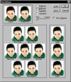
It isn't easy being green. This young man is looking good except for the distinct green tone to his skin. A simple color balance adjustment puts him back in the pink, as seen below.
Photoshop's Variations window, providing samples of incremental color change for selection.
|
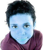
Anyone who has studied color adjustment will know that I am not going very far with this subject in this article, especially considering that I only have this page. Color adjustment on a professional level is often learned in an apprenticeship setting, and takes years to perfect. However, that level of expertise is only necessary for print, and there are simple adjustments that can help you with most of theWeb images you will encounter. The image at the left is a good one. It is sharp and has good contrast, but the little guy is a little on the green side. A simple color adjustment will return him to complete health if only "real life" was this easy. Raster programs offer many ways to adjust color. Rather than go through each program, step-by-step, which would take pages and pages, I will cover the general color adjustment methods, which are similar in all programs. Hue and Saturation You have probably heard of objects referred to as having a particular
color hue. Perhaps it is a dramatic sky with an orange hue, or a room
with filtered sun and a blue hue. Generally, hue refers to the underlying,
but often unmistakable color. Some digital cameras consistently produce
images with the same hue. Scanners can return results that always have
a color cast to them. Adjusting the hue in an image can correct an overall
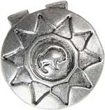
incorrect hue. Hue can also be used for artistic effect, The best way to understand hue is to watch the effect in an image as you change hue values. The image at the right shows a dramatic hue change. Note how the color of everything in the image has been changed by moving the hue value to blue. Saturation is easy to grasp if you realize that reducing saturation all the way creates a grayscale image containing no color. Saturation is like the volume for color. Turn it up and the image becomes quite intense with color. Turn it down, and the color fades away until finally, there is none left. Saturation can be an excellent tool when you are working with images of anything metal, including jewelry. Reducing the saturation leaves detail and a bright, shiny result, yet does not wash out detail the way that other methods can. Be careful that you do not go too far with desaturation, but as you can see below, the results can be rich. The image on the left has yellow overtones. Using a partial desaturation removed the color cast without affecting any other properties.
|
|||
|
|
Color Balance As with hue, one of the best ways to learn what does what in color balance, is to practice. Open an image and with the preview active, observe what happens when you move the slider closer to each color. Photoshop offers a screen that shows variation of color combinations and allows you to choose the one that best suits what you require. |
|||
|
|
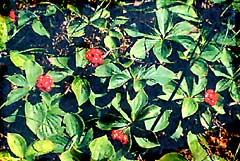
Working with color can be frustrating, as almost all change happens in very small increments. I wish I had a magic answer for you, but I do not. In fact, the route to understanding how to work with computer color adjustment is in direct proportion with how much you know about color overall. If you paint, your knowledge of color mixing will help with computer color adjustment. Learn how the color wheel works so that you can truly understand how colors mix and affect each other. Working with color can be very rewarding, though, and well worth the extra effort. The image at the left seemed to be hopeless. With an increase in saturation and contrast, and some slight color adjustments, topped off with sharpening, the final image is a long way ahead of its humble beginnings. We have one more area to cover in our quest for excellent images. All your hard work will stop short of the mark if you do not sharpen your images. |
|||
Web Photos that Pop: Tutorial IndexDon't Be Scared by Print Instructions |
Created by Wendy Peck,
URL: https://www.webreference.com/graphics/column49/
Created: July 10, 2001
Revised: July 10, 2001


 or
to make a series of unrelated, varied-tone images appear to be part
of a set.


 Find a programming school near you