Graphic Underworld pg 6: Production Graphics with Wendy Peck at webreference.com
 |
Graphic Underworld: How Compression Works | |||||||
|
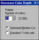
The top sample here has had colors reduced to 16 on export, for a file size of 2.43 k. The bottom sample, which looks identical, was exported at 256 colors, 3.48 k. |
First, to prevent a flood of mail, I am not trying to be scientifically correct here. I am not going to be dissecting algorithms or looking at the mathematics behind optimization just addressing the practical application to help designers create smaller graphics. Whatever the science of compression, what counts for us as designers, is to consider what can we do during the design process to minimize the size of our photos. I will get to the optimization stage of image preparation before we leave the topic, but for now I want to talk about considering file size as we create the look. GIF files can contain a maximum of 256 colors. Most of us know that, but it is also important to know that we may not need all 256 colors. In fact, it is rare that we do. Most of the screen shots created for my articles use 8 or 16 colors. The savings on each shot are not significant, but since there are often 10-15 shots per page, it adds up. More important for GIFs though, is where the color is located. GIF file information is (and here is where I am going non-tech) read from side to side just like we read. If we can provide a good run of the same color from left to right, GIF information can pack in very tightly. Look at the samples below. These samples were all created from the same file, and I saved them all at 128 colors, since the first sample required that many to hold the colored noise pattern. Look at the file sizes. The only difference is the texture, and how large a pure color area is available in each line of pixels. Of course, the first sample would probably be better saved as a JPG, and the second and third samples should have had the colors reduced substantially, but I wanted to show the dramatic difference that could be found in one small sample.
So, if you can keep solid areas of color, or make texture run side to side as opposed to vertically or randomly, you will save file size. Be careful with dithering as well. Dithering can help eliminate banding in gradient fills, but it comes at a file size cost, since you are adding breaks in color runs. (You can read more about dithering and gradient fills in the Gradient Fills tutorial.) |
|||||||
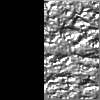
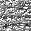
Even with compression levels set to exactly the same, the solid color area in the image at the left allows a smaller file size.
|
JPG files can also be reduced by providing solid color areas. JPG compresses by combining the information in adjoining pixels and tossing out the unnecessary information. It is easy to see how low contrast areas can be compressed to a higher level without quality loss. But even when the compression level is the same, as in the samples here, solid areas will provide smaller images. You can also increase the compression settings in low contrast images for even more file size savings, since combining information will not distort the image, or leave the artifacts that occur when a high contrast file is compressed. So ... should you design only with file size in mind? No, since we might as well go back to the gray backgrounds and no images if we are going to become obsessive about file size. However, if we keep even the few little points I have covered here in mind as we design, we can make choices with file size in mind. A textured background may provide exactly the same look with a horizontal orientation as it does with a vertical one, yet the end file size will be dramatically different. If you are concerned about file size (and you should be) and want to work more quickly while you create tiny image files (who wouldn't?) then you must carry on to discover one of the best weapons I have used or seen for reducing file size quickly and effectively. |
|||||||
|
|
Graphic Underworld Tutorial IndexGraphic Underworld Start |
URL: https://www.webreference.com/graphics/
Created: August 5, 2000
Revised: August 5, 2000


 Find a programming school near you