Designing with Chaos. Adjusting Chaos
| Adjusting Chaos |
|
|
 |  |  |
| a | b | c |
| Fig. 3: From artificial to genuine: the degrees of chaos |
|
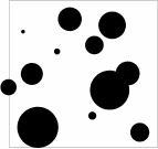
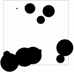
In Fig. 3, all three images display a number of random-sized
circles randomly scattered over a square. As you can see, the degree
and character of randomness in these images varies greatly, and
correspondingly the look-and-feel of these simple compositions differs a
lot.
The pattern of Fig. 3, a is undoubtedly chaotic and can contribute its random motif to a bigger composition if used as an element. However, I would call this style "naive chaos" - its artificial component is very obvious, and such a deliberate attempt to "civilize chaos" may look too pathetic. A similar effect might be the result of a novice designer unsuccessfully trying to imitate genuine chaos; on the other hand, it could perhaps be also used in a professional composition if the chaotic theme it introduces is intentionally subdued. Much more persuasive is the chaos of Fig. 3, b, where perhaps the optimal mix of genuine randomness and careful touch-up is achieved. Yes, unlikely as it may seem, this image did require a lot of manual tweaking in order to achieve that "genuinely random" look without exaggerations or over-simplifications. Such tweaking is, in fact, an important skill for a designer. It requires some training and a keen eye to judge how many "chance" repetitions, coincidences, or alignments would still look natural and thus improve the randomness of the layout. It also involves balancing the natural desire to distribute objects evenly to avoid overloading any particular area with the understanding that such distribution is unlikely in a statistically viable example of chaos. Sometimes it may require artificial introduction of a couple "special cases" with objects, for example, falling upon the very boundary of the chaotic region (one such special case can be seen on Fig. 3, b). Thus, just as a piece of art doesn't need to reproduce natural phenomena with absolute precision in order to be persuasively lifelike, the best chaos is usually created by hand. Of course it may happen that a naturally random process, such as meteorites leaving craters on the surface of the Moon, would create patterns similar to Fig. 3, a or b. But much more likely (in fact, orders of magnitude more likely) is a less satisfying outcome such as that of Fig. 3, c. This last image is the only one that was actually generated by a computer program with a "random number generator" function without any manual touch-up afterwards. Anyone would agree that this layout is way too weird to exemplify any sensible concept, even the concept of chaos. Too uneven distribution, too strong contrast of circle's sizes, too many mergers and edge overlays - all this makes it really difficult to figure out what idea this image is supposed to represent. The historical approach, however, forces me to make some reservations. Indeed, the perception of chaos cannot stay the same as art and the entire visual environment surrounding us undergoes serious changes over centuries. So, although currently we perceive b as the most persuasive way of orchestrating the voice of chaos, some centuries ago a alone would probably be deemed acceptable, and some centuries (or decades?) from now, c may well get into the design mainstream. |
![]()
![]()
![]()
![]()
![]()
Revised: May 15, 1999
URL: https://www.webreference.com/dlab/9905/chaos.html
 Find a programming school near you