Dynamic Design. Eye Flows: Direction
| Eye Flows: Direction |
|
In fact, the concepts of contrast and dynamism can be treated as two aspects of the same thing. Whenever we establish a contrast link between two objects in a composition, we thus encourage the viewer to pay a special attention to this pair of elements - to compare them and analyze the way their relation works. All this means that the viewer's eyes will be jumping from one object to another, thus inducing a flow of vision, a separate stream on the "perceptual map" of the composition. I call these streams eye flows, and below is a brief analysis of how they reflect the properties of the objects that generate them and affect the perception of the composition. Sometimes, when two objects have more features in common than they have differences, an eye flow connecting them does not have a well-defined direction (compare to a line with symmetric ends). But more often, our eye will more naturally slip from one object to the other, whereas "ascending" back will require some force of concentration. We tend to easily glide from big to small, from dim to crisp, from pale to saturated, from images to text - in a word, from less distinctive, less expressive, less complex objects to those more eye-catching and information-packed. One could say that the denser and more prominent an object, the stronger its "gravity force" of attracting viewers' eyes. On the other hand, the habits of reading text (from left to right) and watching objects fall (from top to bottom) make these two directions more natural for the visual perception in general and eye movements in particular. This results in the "gravity field" with vaguely diagonal direction (from top left to bottom right) that overlays the page and makes some of the contrast links much easier to follow than others. I would compare this factor to a constant wind blowing over the pool of your composition and aiding your eyes to sail downwards and rightwards. This inherent directionality of perception should always be taken into account in design. A simple but instructive example is readily available: note that in the article on contrast, I put the smaller black square in the lower right corner of the outer square (see Fig. 6 and 7 on that page). More examples are provided in abundance by logos, which most often follow one of the two possible layouts shown on Fig. 9: the text part of the company's name is either below or on the right from the graphic part - this is easy to explain if we consider that an eye flow always starts from the graphic and lands on the text. |
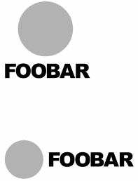
| Fig. 9: The two most common logo templates suggest the most natural directions for eye flows from images to text |
![]()
![]()
![]()
![]()
![]()
![]()
Revised: Mar. 16, 1999
URL: https://www.webreference.com/dlab/9903/eyeflow.html
 Find a programming school near you