Using Artwork in Design. Embedded artwork
| Embedded artwork |
|
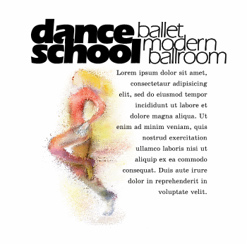
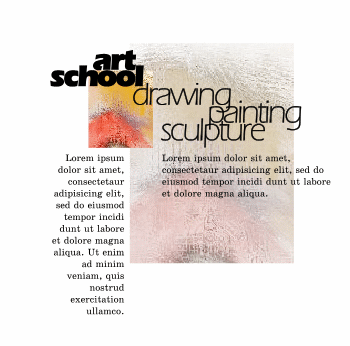
Sometimes an image is clipped out of the background at the borders of an object, just as one would do with a photo. Even with a photo that is a bit out of focus (or simply enlarged beyond a certain limit), a crisp edge would contradict with the blur of the interior. It therefore rarely works with artwork whose wealth of textures makes any "clear cut" look artificial. In other words, if you want a piece of artwork to be masked off of the background, you should paint it that way, because cutting the "live flesh" of a completed picture is painful and often unsatisfactory. (On the contrary, the displaying method above works best with crisp linear edges, regardless of the image's texture). Thus, it is easy to figure out what sort of images could benefit from embedding: namely, those containing a single integral object with more or less obvious borders, where it is easy to tell the object from the surrounding background or there is a pronounced compositional center. Due to this inherently centric nature, an embedded image usually acquires a significant compositional power on the page, sometimes taking control over the rest of the elements and arranging them relative to itself (as it happened on the Oracom brochure's first page where the image occupies the dominant central position). If we put such an image, with its own intrinsic opposition of the center and the periphery, into a rectangular frame, that would introduce another "layer of bounding" resulting in a clash or, at least, a tautology. Therefore reusing, or creatively elaborating upon, the contours already present in such images seems to be the only satisfactory way for implanting them into design compositions. An example is presented on Fig. 4: An advertisement page for a fictitious dance school uses a dancer picture which, like most other monofigure works, is embedded in the composition. However, since the texture of this image is quite interesting by itself, its small, open-ended fragment with no recognizable objects on it could be displayed as a separate decorative element in another composition (Fig. 4, bottom). Conversely, a multifigure displayable composition may provide you with embeddable figures if you'll manage to cut them out of the background separately. As we've seen in the Oracom example above, the original embedded image can be the source of both embedded and displayed fragments. |
 |
 |
| Fig. 4: Examples of using embedded (top) and displayed (bottom) graphics; both compositions use the same piece of artwork as the source. |
| The same pair of works (Fig. 4) illustrates the compositional power of embedded images. Despite the fact that artwork occupies a bigger relative space in the composition at bottom, it will tolerate removing the displayed images altogether - the page will lose much of its drive, but it will remain a balanced whole. If, however, you remove the dancer figure from the top example, you'll end up with a terribly unbalanced page deprived of one of its compositional pillars. |
Revised: Dec. 11, 1998
URL: https://www.webreference.com/dlab/9812/embedded.html


 Find a programming school near you