Using Artwork in Design. Drawing or painting?
| Drawing or painting? |
|
|


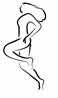
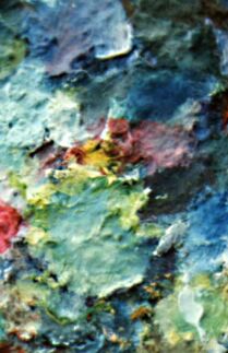
| Fig. 1: Form (shape, contour) and texture (surface) as the two pillars of artwork. These two images would be of a quite different value for a designer, and understanding their different nature and different roles in design is important |
|
In the aspect of form, only a skilled artist can provide a designer with
a simple yet recognizable sketch of a given object, with its outline
generalized and distorted in a peculiar way. Usually, the majority
of a composition's real estate is occupied by straight lines and simple
curves, so the softly streaming artwork shapes (Fig. 1, left) may become
not only a refreshing change, but a foundation of the entire design.
The same applies to the textural diversity of artwork. A striking contrast to the soft blurry textures in photographs and the flat color dominant in the rest of the page, the genuinely natural brush strokes or engraving patterns in an artwork fragment will add a new dimension to your work. Much as the pure outline does not necessarily need a textural accompaniment, the texture aspect may be quite self-sufficient: You can take something like Fig. 1 and base your work on its distinct "look and feel" without a reference to a particular object (an example of "displaying" as defined later in the article). From a more general viewpoint, both new forms and new textures introduced with an artwork fragment are interesting and attractive if they feature at least one of the following qualities:
Of these two concepts, generalization is in many ways akin to the form aspect of graphics, and it is therefore more obvious in images where the outline aspect prevails. Contrastingly, textural variations are more likely to be thought of as "distortions." This multiaspect dichotomy surely has something to do with the different functions of right brain (the one that deals with complex textures, music, and emotions) and left brain (that recognizes generalized forms, uses logic and speech). |
Revised: Dec. 11, 1998
URL: https://www.webreference.com/dlab/9812/drawingorpainting.html


 Find a programming school near you