Logo Design Revisited. Old logo reused | WebReference

Logo Design Revisited. Old logo reused

 
  Old logo reused


One of my customers, Squareware Inc., wanted a corporate logo to express the dynamic and innovative nature of their software business. Also, they wondered if they could have the idea of a square incorporated in the logo in some way.  Ken Lowery, President at Squareware, mentioned the old sample logo from my Design Lab article and asked if I could adapt that design to his company's logo.

I can't say my first reaction was a burst of inspiration.  As I said, I wasn't really fond of that work, my only excuse (or is it an aggravation?) being that it was an illustration in an article, not a commercial design.  But then I wondered if I could take from the old design what was worth reusing, and develop it further while eliminating its flaws.

Of course, it wasn't that I took a sheet of paper and set to work itemizing the hits and misses of my old design (as they are itemized below).  In fact, this happened to be one of my easiest projects ever, as the logo was created in a snap and immediately approved by the customer without any modifications.  (There were several other logo variants that I presented, but I won't digress by describing them here.)  It wasn't until I tried to consciously analyze the differences between the two logos (see Fig. 1) that I realized how really bad the old one was and why it was nevertheless possible to transform it into something decent.


Figure 1, a             Figure 1, b

  Fig. 1:  Two years after: A good idea for a logo is not enough for being able to implement it in an acceptable way  

  Let us start, however, with positives rather than negatives by figuring out what is common in two designs and why these features proved worth preserving.

  • The 3D illusion of an object standing on its corner and the "drop shadow" underneath.  In the old design, instead of a drop shadow we see a more complex arrangement, reminiscent of a transition or "blend" in a drawing program, but the 3D effect is present in both cases - we can easily tell what parts of the squares are supposed to be closer to us and what are further away.  This illusion became the primary "visual concept" of the composition, the feature that makes it different, for human perception, from a random combination on shapes.

    It is not an overestimation to say that an interesting yet not too obvious visual concept is what really makes a logo out of dead material.  A logo concept doesn't need to be a metaphor of some real world object, but may use an abstract shape whose appeal is purely formalistic.  Classification of logo concepts is a large topic, perhaps deserving an article of its own. Here I would only like to note that 3D effects, perhaps due to the strong contrast of their inherently naturalistic and even photographic implications with the geometric austerity of logo shapes, are the most popular and productive concepts used in modern logos.

  • Asymmetry.  In both logos, the squares are rotated a bit counterclockwise from the vertical axis.  This makes the 3D arrangement of the squares more prominent and, instead of a balance of symmetry, introduces a more powerful and dynamic balance of directions: the axis of the square which is slanted to the left is propped up by the line of interaction between the square and its shadow (or, in the old logo, the "transition" guideline) which is slanted to the right.  Here again, the logos are in full compliance with the design state-of-the-art which largely prefers asymmetric compositions.

  • The overall composition in both logos combines the slightly asymmetric graphic part with a centered text line below (see next section for more on text formatting and positioning).  For the new logo, however, I provided an asymmetric variant with the text line on the right, aligned with the "drop shadow" from aside (Fig. 2).  As in this variant text is relatively larger, it can be used to preserve legibility in contexts where the entire logo has to be small. (Two logo variations are certainly not the maximum; go visit my Dessert Links for a much more complicated AT&T example.)
 

Figure 2

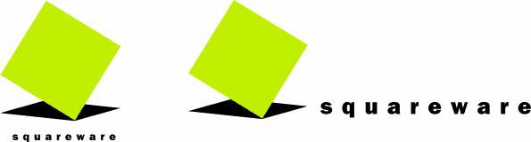
  Fig. 2:  The two variants of the Squareware logo with different text sizes  

Created: Nov. 10, 1998
Revised: Nov. 10, 1998

URL: https://www.webreference.com/dlab/9811/reused.html