Logo Design Revisited. Engineering a logo system
| Engineering a logo system |
|
Unfortunately, when I was first contacted by the customer, we only discussed the corporate logo, and the idea of creating a separate product logo was not formulated until the company logo was finalized and approved. It may therefore seem odd that for the company logo, I used the graphic features of the product, imitating the outlines of the Travcyl device (it has four cylinders located at 90 degree angles, as shown on Fig. 3 at bottom), while for the Travcyl logo created later I had to find another visual concept. |
 |
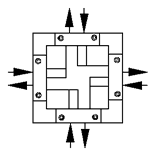 |
| Fig. 3: The Encynova logo (top) is a variation on the theme of the Travcyl device layout (bottom)... |
|
The Encynova logo was also relatively easy to create, thanks to the
visually rich engineering design of Travcyl that provided an immediate
clue for the graphic design of the logo. However, when I was asked to
create one more logo for the Travcyl itself, this turned out to be a
difficult task.
Those who have read my articles on modular design and reusing elements would expect me to try a "modular" approach for these two logos, with some common aspects providing consistency of style (most importantly in colors and fonts) and some creative variations introduced in the more flexible aspects (forms and layout). Myself, I was leaning in this direction until I made my first drafts - but this approach didn't seem to work. |

| Fig. 4: ...So for the Travcyl logo, a more general metaphor of "dripping liquid" was to be found |
|
The solution I finally found may seem unexpected at a first glance (Fig. 4). The "T" in the logo combines the ideas of "fluid" and "fluid measurement" (medicinal liquids are sometimes dosed by counting drops), which sits well with the primary use of the Travcyl for precise measurements of liquids in medical industry. However, it is especially interesting that this logo is very different from the Encynova logo, only sharing a common color, and I'd like to show why this is an advantage rather than a mistake. Experience shows that logo elements can be successfully and repeatedly reused, for example, on a Web page with that logo, much as a musical theme written for a film can be reused over and over, in whole and in parts, played by different instruments, as a background for dialogs or as a sound track of its own. I found, however, that you cannot easily borrow elements from one logo into another, just as you cannot plagiarize from someone else's music when writing your own - not only for fear of being sued, but because that will automatically make your music inferior in quality. As long as you're creating logos intended to be recognized as different, you should use quite different means of design. Admittedly, it is sometimes possible to create several purposefully similar logos in parallel, by rearranging a common pool of elements that were designed from the start to form variable combinations (continuing our musical analogy, that would be like creating a series of pieces with a common theme, or a series of rearrangements of an original piece). However, a series of similar logos can only work for a series of similar objects, e.g. a number of sibling products by a single company. Here, we have too few objects (only two) to form a series of logos obviously elaborating on a common theme. More importantly, these two objects form a hierarchical rather than one-level system of relations, one of the logos belonging to a company and the other to its product. Finally, as you already know the Encynova logo was created first, without any plans of its reuse or modification, and the Travcyl had to accommodate itself to the already finalized, approved by the customer, and generally quite self-sufficient company logo. That's why the Travcyl logo presents the most consistent and strong (and therefore stable) contrast to the Encynova logo. The two logos contrast in their use of colors (one color in Travcyl instead of two in Encynova), fonts, slight 3D effect (the spotlights on the Travcyl's drops) and, most importantly, in the overall style and attitude, a bit more frivolous and "cute" in Travcyl. This logo, so to say, willingly retreats from the stylistic field occupied by Encynova, trying to prevent any possible conflict between them. It is enough to complement these contrasting aspects by using different sizes and the logos would form a nice match, as on a sample device panel shown on Fig. 5. |

| Fig. 5: The two logos on one panel |
![]()
![]()
![]()
![]()
Revised: Nov. 10, 1998
URL: https://www.webreference.com/dlab/9811/engineering.html
 Find a programming school near you