Modular Web Design. On and on
| On and on |
|
But first, I'd like to call your attention to how the blue HR-like gradient separator positioned below the banner and the heading just below that separator, with their quite different styles, look nice together---exactly when they're so close to each other (e.g. on this page). This suggests that my decision to make them different length was not incorrect. |
|
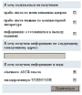
Lists of books, naturally abundant on a bookstore site, introduce
the tables theme. I once mentioned that using the default
bevelled rules to separate table cells is unacceptable in a serious
design; yet the complex nature of these tables requires some visual
aids to help follow the rows and columns. To this end, I introduced
flat-color background fills (or "screens," as they're called in
traditional typography) for every other table row.
Thanks to its numerous gradients, the blue is the only color in this composition that allows deriving a light enough shade for this purpose. But the background color in tables is not only brighter than the blue of the page's sidebar, it is also much less saturated. Remember what I once wrote about bright colors favoring low saturation level? Here, this fact can be explained from another point of view: As the light color is a blend of the original dark color and white, it has to be less saturated than the former because white has zero level of saturation. (Refer to this article to better understand saturation and other color parameters.) The small, 22x11 pixel "New" and "Bestsellers" (with moving stars) orange icons on the sidebar were also used in the book tables to mark newly arrived or best-selling books. Using the same small size and orange color (remember, these are the two parts of a module, not to be used separately), I created similar markers for discounted books and buttons with arrows for browsing long, multi-page lists of books (such as this one). Note that the icon with the stars is the only animated graphics on the entire site---you only can use something for accentuation when it is used very sparingly. |

|
It is also important to use the same format for all book tables on
the site---subject catalog pages, lists of bestsellers and new
books, search results, shopping cart listings, and so on. In fact,
it is natural from programming point of view as well, because all
pages with book lists simply call the same Perl file for creating
the corresponding section of HTML code.
It was equally natural to use the color that I found for table rows in other places where parts of text require accentuation, but no heading or separator blocks are possible. Most often, light blue screens are used in input forms (such as this subscription form), where they routinely mark text lines separating groups of controls, as well as the last line with the Submit button (which is always right-aligned). . . . And on and on. I hope that by now, you've got some idea of how the theory of consistency translates into the practice of modular web design. If your modules are well designed to start with, your work is likely to become much easier towards the end---it's really a pleasure to see your mature, tested, polished design modules readily jumping in to satisfy every demand of your site's content. On the other hand, badly chosen materials may quickly turn your work into a nighmare. Now I see that, unlike the Quiotix article, this one shows more of the site's final state than of the way that led to it. The reason is obvious: My goal was to show you the consistency principle at work, and most of the initial drafts were thrown away exactly because they offended that principle. I hope that this account will help you get---"the easy way"---at least some of the experience that I have acquired "the hard way" from working on this project. |
|
![]()
![]()
![]()
![]()
![]()
![]()
Revised: Jan. 22, 1998
URL: https://www.webreference.com/dlab/9801/onandon.html
 Find a programming school near you