Modular Web Design. The logo
| The logo |
|
But before starting to work on page drafts, a logo for the project had to be created (it seems to become a tradition to begin my case projects with a logo design introduction). This time I'll be brief with the logo saga, however, leaving out many intermediate steps, because the process was unusually long and cumbersome. The logo for this project was being developed along with gradually defining the goals and scope of the site itself. Thus, one of the initial versions I'd like to show you (Fig. 1) was bilingual, making the English domain name (Books.Ru) as prominent as the Russian name of the site (the second line which reads "Books of Russia" in Russian). The appeal of this draft lies mainly in the contrast between the curled left page of the "book" and the rigid, strictly horizontal, lines of wide letters with long serifs. This contradiction makes the main shape expressively symbolic, and its asymmetry is supported by the asymmetric lines of text moved down from the vertical center of the composition. The small circle, derived from the dot in the domain name, was an attempt to make a knot tying together the shape and the text. |

| Fig. 1: One of the early logo variants |
|
Later, however, it was decided to remove the domain name from the logo, not binding the project to a particular domain or to the Web in general. Also, as the new bookstore was an offspring of the Symbol publishing house, the customer asked if I was able to somehow incorporate the Symbol logo (Fig. 2) or some of its elements into the new logo. |
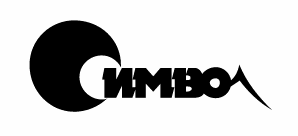
| Fig. 2: Logo of the Symbol publishing house (not created by me) |
|
The final logo shown on Fig.3 combines some of the features of the initial version (Fig. 1) as well as the initial stylized letter "C" of the Symbol logo (Fig. 2). My goal, however, was to make that object perceived not as a letter, but rather as a shape working as a "bullet" to call attention to the text. So I painted it black, as is the first line of the text, and aligned against the capital, but for the text I chose a very different font with thin strokes, not reminiscent of the original Symbol logo. The orange disk behind the "C" is a descendant of the small disk of Fig.1, as is the "book page" on its left (now it can just as well be called a "flag"). However, the contrast between the curved shape and the flat text is now gone, so I had to add a finish to that shape---that vertical shadow across the page---to make its bend more natural. |

| Fig. 3: The logo is almost ready (can you find the difference from the final one on the site?) |
|
It was especially difficult to find the color for the second line of text. It was clear that no other color was acceptable here besides the orange and the black, and none of these two colors worked because it had to be contrasting with both the disk and the top line of letters, with which it partially overlapped. In such cases, a shade of gray is usually a good choice, but here it didn't work either because, all other aspects of the two lines of text being similar, any different color for the bottom line would result in a too harsh contrast between the lines. After many attempts, I found that a gradient from gray at the top to white at the bottom looked acceptable for the second line of text (Fig. 3). The gradient, introducing a new texture into the composition, somehow conceals the color inconsistency of that element (the gradient appears to blend the black of the top text line with the white of the background and thus has, as it were, no color of its own). To make the bottom of the letters legible, I added a drop shadow behind the text---which is another, supporting instance of photographic texture. Some time after the site was launched, it occurred to me that I can, without changing the layout, improve the logo by loosening the somehow awkward "knot" where the capital letters unite over the orange disk. As you can see on the site's front page, now the capital P is layered beneath the disk---which leaves a bit more air to breath for the letters at top and makes the whole thing more tightly integrated (while maintaining text legibility). |
![]()
![]()
![]()
![]()
![]()
![]()
Revised: Jan. 22, 1998
URL: https://www.webreference.com/dlab/9801/logo.html
 Find a programming school near you