DHTML Application Toolbars - DHTML Lab | 2

DHTML Application Toolbars
simply text
A typical Windows application text-only toolbar looks like this:
![]()
When the user mouses over a toolbar item, the item is buttonized, like this:
![]()
The "button" look is achieved by the addition of a three-dimensional border. In close up:

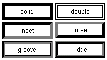
With IE DHTML, we can easily duplicate this behavior in a Web page using CSS borders. The table below illustrates the borders available to us:

To buttonize an element, therefore, we can apply an outset border to it. For a "pressed button" look, we can use an inset border.
Let's try it.
In your page's stylesheet, create a but class, to be applied to all elements we need buttonized:
<STYLE TYPE="text/css">
.but {
    border:2px buttonface solid;
    padding-top:1;
    height:20;
    text-align:center;
    cursor:default;
}
</STYLE>
The but class styles the toolbar items in their idle state. Notice that we define a border for the items with a color of buttonface and a style of solid. In essence, we are creating an invisible border, since we will also apply the buttonface color to the items themselves. This invisible border is necessary because borders are placed inside the item's boundaries. The existence of a border determines the position of the text within the item. If there is no initial border and we add one later, the item's text will be repositioned, creating a jerky effect.
The other properties can be given values that apply to your particular application. In the case of our example, the padding and height values help to position the items vertically in a toolbar that is 22 pixels high, which is defined in our Web page as a DIV element:
<DIV ID="toolbar"
   STYLE="width:250;height:22;overflow:hidden;
          background-color:buttonface;
          font-family:MS Sans Serif;font-size:8pt;
          padding-top:1px;padding-left:2px;">
  <SPAN CLASS=but STYLE="width:32"
        onClick="yourFileFunction()">File</SPAN><SPAN
        CLASS=but STYLE="width:34"
        onClick="yourEditFunction()">Edit</SPAN><SPAN
        CLASS=but STYLE="width:39"
        onClick="yourViewFunction()">View</SPAN><SPAN
        CLASS=but STYLE="width:59"
        onClick="yourFavoritesFunction()">Favorites</SPAN><SPAN
        CLASS=but STYLE="width:42"
        onClick="yourToolsFunction()">Tools</SPAN><SPAN
        CLASS=but STYLE="width:36"
        onClick="yourHelpFunction()">Help</SPAN>
</DIV>
Our toolbar contains SPAN elements for each item. The width of each element is, again, up to you. The styling of the DIV, however, is mandatory. It is given a background color of buttonface to conform to the user's selected desktop scheme. The Windows system font, MS Sans Serif, is used to complete the "OS application" look. These properties are inherited by the SPAN elements. Every SPAN element also has an onClick event handler. This should execute the JavaScript function or statements appropriate to the item. We have now created an HTML element that looks just like the screenshot above:
To achieve the toolbar behavior, we need some JavaScript, which we include at the end of our Web page:
<SCRIPT LANGUAGE="JavaScript1.2" TYPE="text/javascript">
allSPANs = toolbar.children;
for (i=0;i<allSPANs.length;i++) {
    tSpan = allSPANs(i);
    tSpan.onselectstart = function(){return false}
    tSpan.onmouseover = function(){
        this.style.border = "2px buttonhighlight outset";
    }
    tSpan.onmouseout = function(){
        this.style.border = "2px buttonface solid";
    }
    tSpan.onmousedown = function(){
        this.style.border = "2px buttonhighlight inset";
    }
    tSpan.onmouseup = function(){
        this.style.border = "2px buttonhighlight outset";
    }
}
</SCRIPT>>
</BODY>
</HTML>
Our JavaScript first identifies all the SPAN elements contained in the toolbar DIV. Since the DIV contains only the SPAN elements, these elements are reflected in the DIVs children collection. For easy reference, we assign the collection to the allSPANs variable.
We then loop through allSPANs, identifying each element as tSpan, again for easy reference, and we assign five event handlers to each element:
- onselectstart
- We do not want the user to inadvertently highlight (select) the item text when dragging over it, so we return false from the selectstart event.
- onmouseover
- When the user mouses over an item, the border color is set to buttonhighlight, creating a lighter shade, and the border style to outset, creating the 3D button effect.
- onmouseover
- When the user mouses out of an item, the border is restored to the idle state, defined in the but class.
- onmousedown
- When the user mouses down on an item, the border retains the "over" color, but the style becomes inset, creating the "pressed" button look.
- onmouseup
- When the user mouses up on an item, the border is restored to the "over" look.
Put it all together and we have this application-like text toolbar:
Why did we use two pixels instead of one for the border width, when in the original screenshot above, the application border is clearly one pixel?
When creating borders on regular HTML elements, the one pixel version does not show up well, as in this example:
That's it for simple text toolbars. They work fine and can come in useful. We, however, recommend a slightly more complex, and at the same time, more elegant approach.
Produced by Peter Belesis and
All Rights Reserved. Legal Notices.Created: Jan 25, 2000
Revised: Jan 25, 2000
URL: https://www.webreference.com/dhtml/column29/2.html


 Find a programming school near you