Santa Fe Style 2- GIF Animation Studio
|
|
|
"The folks at Zoom had me focus on the opening screen animation and games while they designed the site," Erik relates. "The real exhibit, in Santa Fe, has a video wall showing images of objects that are actually in the exhibit." We wanted to achieve the same effect online but with images more stylistically related to those in the exhibit and with an eye more toward a stylistic interpretation of folk art and junk art."
|
|
The Zoom designers went out to a junk shop in Houston and shot about 50
images of various old bottle caps,
license plates and other general detritus. They sent JPEG files of these
photos to Erik with a vague directive to
make things work.
"At that point the online exhibit really was a loose collection of text and images but had no real unifying style. The home page animations really served to set a style for the rest of the site and for the games," Erik says.
| ||
|
Erik mapped out a rough plan for the video wall which would try to
maximize bandwidth-to-surface area by
using only two animated GIFs. One would be small and would repeat a number
of times. The other would be a
larger four-square animation, which maximized bandwidth by positioning
individual squares within the animation
frame.
"In other words, the larger GIF would look like four smaller animated GIFs but would not replace the entire area at any point in the animation," Erik says. This offered two benefits: it would make the animation move more quickly than if the entire area changed every frame and it would allow Erik to synchronize the four frames -- something that would not be possible if he had four separate animated GIFs loading over the wire.
| ||
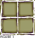 |
With this plan in mind, Erik took the Zoom designers' photographs of junk
and set about to develop the
rough, scratched-out look that you see
on the site. Erik created the look by using scratch imagery as a mask
using Photoshop's Layers palette. Figure
1 shows the background image Erik worked from.
"Once I had the basic layered layout in Photoshop, I moved into Adobe After Effects and began animating," Erik says. After Effects is post-production video editing software from Adobe Systems. It allows you to set timelines for different image layers and specify how the layers are combined. "Once I had an animation that worked roughly the way I wanted it to, I exported the individual frames as PICT files. These PICT files were then run through a couple of Debabelizer scripts which converted them to the Netscape palette, dithered them to roughly 70%, and chopped them into quadrants, finally saving them as numbered GIF files," Erik explains. Now that he finally had component GIF files, Erik pulled them into GIFBuilder and set the timing, offset and looping specs. "After repeating this process a few times, going back into After Effects and tweaking the animation, going back to DeBab and tweaking the dither, and so on, the final frames and animated GIFs were produced," Erik says. The job still wasn't over, though. After the animations were finished, the page still had to be laid out. The page uses HTML tables, which we explain in some detail below. "The whole page was then tested in Netscape Navigator and Internet Explorer," Erik explains. "We found then, to our dismay, that IE2 did not correctly interpret the offsets and just stacked animation frames on top of one another. A couple of calls later we had been reassured that IE3 would correctly support GIF animation offsets. So we called it finished."
|
![[Part 1]](graphics/back-slate.gif)
![[Part 3]](graphics/more-slate.gif)
Comments are welcome
Copyright 1996 Songline Studios, Inc., Miller Freeman, Inc., and
 Find a programming school near you