WebReference.com - Part 2 of chapter 5 from Information Architecture for the World Wide Web, 2nd Edition. From O'Reilly (2/5).
[previous] [next] |
Information Architecture for the WWW, 2E. Chapter 5: Organization Systems
Designing taxonomies
When designing taxonomies on the Web, you should remember a few rules of thumb. First, you should be aware of, but not bound by, the idea that hierarchical categories should be mutually exclusive. Within a single organization scheme, you will need to balance the tension between exclusivity and inclusivity. Taxonomies that allow cross-listing are known as polyhierarchical. Ambiguous organization schemes in particular make it challenging to divide content into mutually exclusive categories. Do tomatoes belong in the fruit, vegetable, or berry category? In many cases, you might place the more ambiguous items into two or more categories so that users are sure to find them. However, if too many items are cross-listed, the hierarchy loses its value. This tension between exclusivity and inclusivity does not exist across different organization schemes. You would expect a listing of products organized by format to include the same items as a companion listing of products organized by topic. Topic and format are simply two different ways of looking at the same information. Or to use a technical term, they're two independent facets. See Chapter 9 for more about facets and polyhierarchy.
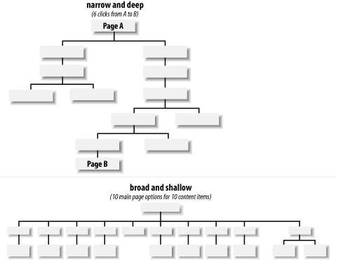
Second, it is important to consider the balance between breadth and depth in your taxonomy. Breadth refers to the number of options at each level of the hierarchy. Depth refers to the number of levels in the hierarchy. If a hierarchy is too narrow and deep, users have to click through an inordinate number of levels to find what they are looking for. The top of Figure 5-12 illustrates the narrow-and-deep hierarchy in which users are faced with six clicks to reach the deepest content. In the (relatively) broad-and-shallow hierarchy, users must choose from ten categories to reach ten content items. If a hierarchy is too broad and shallow, as shown in the bottom part of Figure 5-12, users are faced with too many options on the main menu and are unpleasantly surprised by the lack of content once they select an option.

Figure 5-12: Balancing depth and breadth
In considering breadth, you should be sensitive to people's visual scanning abilities and to the cognitive limits of the human mind. Now, we're not going to tell you to follow the infamous seven plus-or-minus two rule.[2] There is general consensus that the number of links you can safely include is constrained by users' abilities to visually scan the page rather than by their short-term memories.
Instead, we suggest that you:
Recognize the danger of overloading users with too many options.
Group and structure information at the page level.
Subject your designs to rigorous user testing.
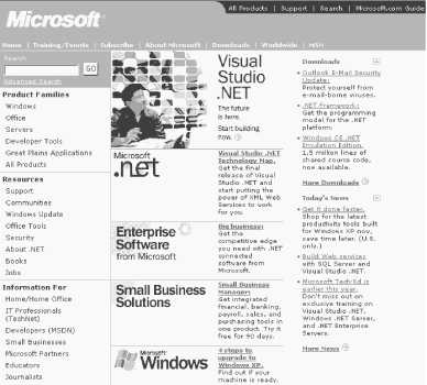
Consider Microsoft's main page, shown in Figure 5-13. It's one of the most visited (and tested) pages on the Web, and the portal into a fairly large information system. Presenting information hierarchically at the page level, as Microsoft has done, can make a major positive impact on usability.

Figure 5-13: Microsoft groups items within the page
There are roughly 50 links on Microsoft's main page, and they're organized into several key groupings:
| Group | Notes |
|---|---|
| Global Navigation | The top right global navigation bar (e.g., All Products, Support, Search) has only 4 links. |
| Local Navigation | The local navigation bar (e.g., Home, Training/Events, Subscribe) has 8 links. |
| Primary Taxonomies | There are 3 primary taxonomies (Product Families, Resources, Information For), each with 6-8 links. |
| Marketing | In the central marketing panel, there are 5 links. |
| Downloads | Under Downloads, there are 5 links. |
| News | Under News, there are 4 links. |
These 50 links are subdivided into 8 discrete categories, with 4-8 links per category.
In considering depth, you should be even more conservative. If users are forced to click through more than two or three levels, they may simply give up and leave your web site. At the very least, they'll become frustrated.
An excellent study conducted by Microsoft Research suggests that a medium balance of breadth and depth may provide the best results.[3]
For new web sites and intranets that are expected to grow, you should lean towards a broad-and-shallow rather than a narrow-and-deep hierarchy. This allows for the addition of content without major restructuring. It is less problematic to add items to secondary levels of the hierarchy than to the main page for a couple of reasons. First, the main page serves as the most prominent and important navigation interface for users. Changes to this page can really hurt the mental model users have formed of the web site over time. Second, because of its prominence and importance, companies tend to spend lots of care (and money) on the graphic design and layout of the main page. Changes to the main page can be more time consuming and expensive than changes to secondary pages.
Finally, when designing organization structures, you should not become trapped by the hierarchical model. Certain content areas will invite a database or hypertext-based approach. The hierarchy is a good place to begin, but is only one component in a cohesive organization system.
2. [Back] G. Miller, "The Magical Number Seven, Plus or Minus Two: Some Limits on our Capacity for Processing Information," Psychological Review 63, no. 2 (1956).
3. [Back] "Web Page Design: Implications of Memory, Structure and Scent for Information Retrieval," by Kevin Larson and Mary Czerwinski, Microsoft Research. See https://research.microsoft.com/users/marycz/chi981.htm.
[previous] [next] |
Created: September 30, 2002
Revised: September 30, 2002
URL: https://webreference.com/authoring/design/information/iawww/chap5/2/2.html


 Find a programming school near you