HTML Utopia: Designing Without Tables Using CSS. Chapter 5: Building the Skeleton
HTML Utopia: Chapter 5: Building the Skeleton
[The following is the conclusion of our series of excerpts from Chapter 5 of the Sitepoint title, HTML Utopia.]
Most books on CSS begin by teaching you how to deal with the bits and pieces of a Web page: fonts, colors, lists, and the like. Then, they move on to explaining the broader issues associated with CSS Positioning (CSS-P), which affect the layout of pages rather than the appearance of individual elements.
In this book, I take the opposite approach. I first look at the site-level and page-level issues involved with CSS design, so that we can understand the big picture perspective of page layout without tables (which is, after all, the primary thrust of this book). And later, in Part III, I’ll discuss styling the content of the pages we’ll be laying out in this and the next chapter.
This chapter focuses specifically on creating the basic structural layout of a Web page or site using CSS. In it, I’ll discuss multi-column layouts—both in general and very specifically—as they relate to the Footbag Freaks site. I’ll teach you about boxes, borders, and the famous Box Model of CSS design. I’ll delve into the intricacies of creating and using two- and three-column page layouts, and into the mysteries of floating objects. I’ll guide you through the process of creating dummy layouts for the pages you’ll encounter in the Footbag Freaks project, and in other projects you may create.
I’ll conclude with the usual tips on dealing with the layout issues presented in this chapter—the issues involved in converting pages to CSS from an existing table-centric design.
Enumerating Design Types
One of the first decisions you have to make when you create any Website, but particularly one where you intend to put CSS to its most effective use, is how many different types of pages and elements you’re going to need.
How Many Page Types?
Most sites use more than one basic page layout. The front, or index page, often has a different look and feel from the “inside” pages. In the Footbag Freaks site, for example, the specification tells us that bread-crumb navigation will appear on all but the front page. An inspection reveals that the large graphic that displays near the top of the front page does not appear on other pages of the site.
On a typically complex ecommerce site, you might run into far more page types. For example, such a site might include different layouts for its:
-
front page (index)
-
catalog pages
-
secure ordering pages
-
main content pages
-
site map page
Some of these pages might display dynamic content that is stored in a database and generated in response to specific user requests. Others might be flat HTML pages that never change unless you redesign them.
The Footbag Freaks site appears to need only one type of page layout. The secondary page has fewer elements than the home page, but the relative positioning and layout of the common elements doesn’t change from one page type to the other.
How Many Design Elements?
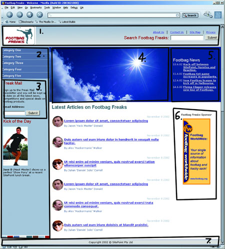
Looking at the Footbag Freaks home page, we can easily identify the following seven design elements, indicated in Figure 5.1:
-
the top of the page where the Footbag Freaks logo appears against a colored background
-
the left-hand column where the site’s navigation is located
-
inside the navigation area, the text field for newsletter sign-up and related text
-
the large image area where the sun, the sky, and the hacky sack appear
-
the news area
-
the sponsor area
-
the footer where the copyright information appears
The second page of the site eliminates the fourth design element from this list and adds a submenu navigation element inside the main navigation. So, each page type has seven design elements, six of which are common, and one of which is unique to each page.
Created: March 27, 2003
Revised: June 16, 2003
URL: https://webreference.com/programming/css_utopia/chap5


 Find a programming school near you