How to Add Fluid Borders to Your Boxes with CSS
How to Add Fluid Borders to Your Boxes with CSS
By Stu Nicholls.
Introduction
In my last tutorial you learned how to style a definition list. This week, I will take this process a little further and show you how to add different fluid borders to your boxes using just CSS.
As with previous tutorials I will take you through these styles in easy to understand steps with diagrams when necessary.
The following link will show you five sample Krazy Korners and I'll show you how to style this type of border. If you resize your browser window you will see that these borders are fluid and stay in shape. Resize the text and they will also stay in shape. The only small problem is found in Internet Explorer which will continue to shrink the top and bottom borders after the main content div has stopped shrinking. This, however, can be overcome using my min-width hack for Internet Explorer .
Krazy Korner Examples
In my experience, this method works with nearly all browsers and operating systems.
Method
Basic idea
The basic idea behind Krazy Korners is that we style the corners using four or five pixel high strips before and after the main content div. These strips are created using styled <b></b> tags. <b> tags have been used because they are faster to type than <span></span> and take up less file space (as good a reason as any).
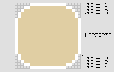
Each strip is created using a background color, a left and right border color and a left and right margin. The basic curved corner was described in detail in my previous article but to recap I will reproduce the enlarged diagram again to show how each strip was organized.

The basic curved corner is comprised of four strips labelled b1 to b4 and in the example above the background color is a pale gold, the border color is white and the outer background color is light grey. Krazy Korners work best with pastel colors as these tend to give a slightly antialiased look (white works really well and is used for most of these examples). Bright colors create a more jagged appearance.
Example 1
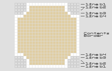
This example has reverse curves to give the effect of cut-out curved corners and the enlarged view below shows how this is achieved.

- b1 - 1px high line with a white background and a left/right margin of 4px
- b2 - 2px high line with a pale gold background, a left/right border 1px solid white and a left/right margin of 4px
- b3 - 1px high line with a pale gold background, a left/right border 1px solid white and a left/right margin of 3px
- b4 - 1px high line with a pale gold background, a left/right border 3px solid white and no left/right margin
- boxcontent - a pale gold background and a left/right border 1px solid white
The XHTML is below:
<div class="curved">
<b class="b1"></b><b class="b2"></b><b class="b3"></b><b class="b4"></b>
<div class="boxcontent">
<h1>Example 1</h1>
<p>A box with cutout corners</p>
</div>
<b class="b4"></b><b class="b3"></b><b class="b2"></b><b class="b1"></b>
</div>
and the styling will be:
/* Curved cutout Borders*/
.curved {
  background: transparent;
  width:40%;
  }
.curved h1, .curved p {
  margin:0 10px;
  }
.curved h1 {
  font-size:2em;
  color:#fff;
  }
.curved p {
  padding-bottom:0.5em;
  }
.curved .b1 {
  display:block;
  overflow:hidden;
  height:1px;
  margin:0 4px;
  background:#fff;
  font-size:1px;
  }
.curved .b2 {
  display:block;
  overflow:hidden;
  height:1px;
  margin:0 4px;
  background:#e0cea3;
  border-left:1px solid #fff;
  border-right:1px solid #fff;
  margin:0 4px;
  height:2px;
  font-size:1px;
  }
.curved .b3 {
  display:block;
  overflow:hidden;
  height:1px;
  margin:0 4px;
  background:#e0cea3;
  border-left:1px solid #fff;
  border-right:1px solid #fff;
  margin:0 3px;
  font-size:1px;
  }
.curved .b4 {
  display:block;
  overflow:hidden;
  height:1px;
  margin:0 4px;
  background:#e0cea3;
  border-left:1px solid #fff;
  border-right:1px solid #fff;
  margin:0; height:1px;
  border-width:0 3px 0 3px;
  font-size:1px;
  }
.curved .boxcontent {
  display:block;
  background:#e0cea3;
  border:0 solid #fff;
  border-width:0 1px;
  }
It's IMPORTANT to specify a font-size of 1px for each of the lines of the curve. Without this IE5.5 will put a gap between each line.
The outer div class 'curved' holds the whole shape together and the width can be set in pixels, ems or percent.
Since the classes .b1, .b2, .b3 and .b4 share common styling the above css could be condensed into the following style.
/* Curved cutout Borders*/
.curved {
  background:transparent;
  width:40%;
  }
.curved h1, .curved p {
  margin:0 10px;
  }
.curved h1 {
  font-size:2em;
  color:#fff;
  }
.curved p {
  padding-bottom:0.5em;
  }
.curved .b1, .curved .b2, .curved .b3, .curved .b4 {
  display:block;
  overflow:hidden;
  height:1px;
  font-size:1px;
  }
.curved .b2, .curved .b3, .curved .b4 {
  background:#e0cea3;
  border-left:1px solid #fff;
  border-right:1px solid #fff;
  }
.curved .b1 {
  margin:0 4px;
  background:#fff;
  }
.curved .b2 {
  margin:0 4px;
  height:2px;
  }
.curved .b3 {
  margin:0 3px;
  }
.curved .b4 {
  margin:0;
  height:1px;
  border-width:0 3px 0 3px;
  }
.curved .boxcontent {
  display:block;
  background:#e0cea3;
  border:0 solid #fff;
  border-width:0 1px;
  }
Example 2
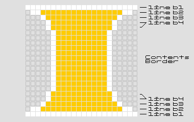
This example has a narrowing curve to create the effect of serif corners and the enlarged view below shows how this is achieved.

- b1 - 1px high line with a white background and no left/right margin
- b2 - 1px high line with a gold background, a left/right border 2px solid white and a left/right margin of 1px
- b3 - 1px high line with a gold background, a left/right border 1px solid white and a left/right margin of 3px
- b4 - 2px high line with a gold background, a left/right border 1px solid white and a left/right margin of 4px
- boxcontent - a gold background and a left/right border 1px solid white and a left/right margin of 5px
Created: March 27, 2003
Revised: May 25, 2005
URL: https://webreference.com/programming/css_borders/1


 Find a programming school near you