Consistent and Readable Type Across Platforms : WebRef Update Feature
|
|
Achieving A Consistent and Readable Type Across Platforms
One of my pet peeves is Web sites that use unbearably small type, or try to
cram too much information into a small space. Any designer who's tested their
site on another platform should know that different operating systems and browsers
render fonts differently on the screen. If you aren't testing
this way, you may not realize that what may look great on Internet Explorer
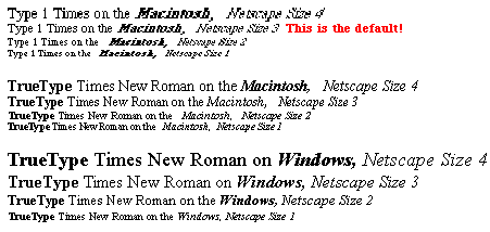
5/Windows, might look like hell on Netscape 4 for the Mac. (See the screen shots
below for a good example of this).
Yes, the world is dominated by Windows, but around 20% of visitors to your site are probably using a different system. Thanks to the iMac, for example, there have been hundreds of thousands of new Mac users on the net in the last two years, even if that only represents a small percentage of the whole.
When I first started designing Web sites on the Macintosh, I was often surprised at how big the text was when viewing my work on Windows. I never understood why until I discovered that Windows renders fonts at 96 dots per inch (dpi), whereas the Mac OS uses the standard 72 dpi. This means that a "12-point" font is 12 pixels high on a Mac screen (as it should be), but 16 pixels high on a Windows-based display. Thus, Web sites designed on Windows are often hard to read on the Mac, and sometimes even illegible.
| Netscape 4 for Mac | Internet Explorer 5 for Windows |
 Ironically, this article about the Mac is almost illegible when viewed on the Mac! You can't even tell where the bold type is. Even on Windows, I find Times at this size produces unnecessary eye strain.
|
 |
This is not just a Mac issue. In Windows, Netscape Navigator displays text smaller than IE, even when you try to use absolute sizing with style sheets. To further complicate matters, the latest version of Internet Explorer for the Mac (5.0) compensates for the different dpi standards by automatically upsizing the text to match Windows! (I understand the Mac version of Netscape 6 also has this feature.)
If you're like me, you like to have absolute control over the look of your site. So how can you achieve a consistent look with legible type across platforms? The best solution I've found is to use a combination of style sheets, absolute-size TrueType fonts and Server Side Includes or JavaScript redirect. It's easier than you think! Read on, and I'll explain.
 Why
TrueType? In general, TrueType fonts are easier to read on the screen because
they have built-in kerning and hinting which optimizes the type at almost any
size. In contrast, PostScript Type 1 fonts are optimized for PostScript printers.
The Type 1 version of "Times" at 12 points is the default font on Mac versions
of Netscape, which can get pretty ugly and unreadable, especially in italics
and small sizes.
A note about the screen shots: Type 1 fonts look slightly better with Adobe Type Manager on the Mac. ATM is turned off in this example.
Thankfully, certain TrueType fonts (such as Arial and Verdana) are now standard on both Mac and Windows (at least, on newer systems). But you should always specify an alternative to the default font, and it should be TrueType. And if you like Times, specify "Times New Roman" so that you get the TrueType version. But don't use FONT tags! Instead, use Cascading Style Sheets (CSS). Not only is this the HTML 4.0 standard, but it paves the way for XML, separating content from style. Using CSS can also greatly reduce your file sizes and download times, because
This article originally appeared in the December 14, 2000 edition of the WebReference Update Newsletter.
Comments are
welcome
Written by Marsha Glassner and
Revised: Dec 14, 2000
URL: https://webreference.com/new/font/


 Find a programming school near you