Graphic Greats: Production Graphics with Wendy Peck at webreference.com | 32
 |
Graphic Greats: Navigation Graphics 2Illustrated Navigation | |
|
Entry page graphics feature text to support the illustrations and photographs in the menu.
Interior pages do not show text as part of the menu, but text labels show with a mouseover. |
Powderfinger The menu is a wonderful stack of random images and illustrations. It looks like a casual, "just thrown together" collection, but if you have ever tried for that look, you will know how much skill and work is required to achieve success with this style. The menu items are all identified on the main page with text. The interior pages have the same menu with the text removed. But the designer has not left us hanging. Roll your mouse over the menu items and you will see some fun effects, but also a text label at the top of the menu in white, which really stands out. (See the second sample here with the text for the bus illustration at the top.) This look is not right for many businesses, but I advise that you take the time to visit and study the way the designer has put the page together, especially the menu. I have never bought into the argument that you have to choose art or clear navigation. This site proves that you can have both. Images © Powderfinger. |
|
|
|
||
|
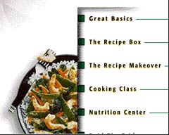
Three menu areas form the start point for a large site.
The photo treatment makes the menu stand out, even on a busy page. Images © Healthy Choice. |
Healthy Choice On the entry page, there are three separate menu areas. The upper right corner buttons offer access to new information quick clicking for regular visitors. Five areas are featured in the white center area, with text descriptions on rollovers. Finally, the row of photographs at the bottom of the entry page offer entry to the specialty areas. I really like what the designer has done with the interior menu. The cutaway photo and shading add dimension to the page and make it easy to find the menu on the page. Note how the menu text is featured on plain white for easy reading on a busy page.
This is a large site, but it is not overwhelming. The sections have been well planned. The main menu takes you to an area, and the interior menu takes over. I had no problem getting to any page on the site from any other. Great example for structure and creative photo use. |
|
|
|
||
|
|
Graphic Greats IndexNavigation Graphics 2 Start/Graphic Curves |
|
URL: https://www.webreference.com/graphics/
Created: May 3, 2000
Revised: May 3, 2000


 Each
of the interior pages also features a skeleton menu (a portion is shown
here) to take you back to one of the main areas. This menu is featured
at the bottom of the page.
  Find a programming school near you