Graphic Greats: Production Graphics with Wendy Peck at webreference.com | 9
 |
Graphic Greats 5: Dramatic Presentation | |
|
|
Designed by and © Elvis D'Silva, Topwritecorner.com. Used with permission.
|
|
 |
Interview
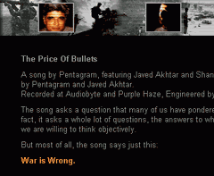
with Tara Deshpande The same border appears at the edge of the blue bar. Although this page has an unstructured style, attention to detail keeps it well organized and directed to the information. Designed by and © Elvis D'Silva, Topwritecorner.com. Used with permission.
|
|
BonusInterested in Flash? Wondering what it is? Written by Flash guru, Marc Hoffman, this tutorial starts well before any I have seen. It describes what the program can do, how it does it and where it is best used. If you are curious about Flash, this is a must read. |
That's it, but before I go ...Learn to watch for special graphics techniques as you surf the Web. We often see great design as a whole without taking the time to put each of the pieces under a microscope. How did they do that? Why does that spot attract attention? The answer is often a very simple, but stunningly creative graphic treatment. Harvest ideas constantly to keep your work fresh and reduce the time it takes you to create great graphics. Check the main graphics page regularly for new additions. And don't forget to send links when you find "Graphic Greats." Send links. |
|
Graphic Greats IndexGraphic Greats Start |
URL: https://www.webreference.com/graphics/
Created: Feb. 10, 2000
Revised: Feb. 10, 2000


 photo. There is a plain black border that neatly frames the photo before
the edge starts to break. You can see the effect even more clearly in
the single photo (from the main portion of the page) shown here.
  Find a programming school near you