Menus with Beauty and Brains 3: Production Graphics with Wendy Peck at webreference.com
 |
Menus with Beauty and Brains 3: Small Fonts Continued |
|||
|
Your letters tell me what subjects are most popular. By that measure, the small fonts topic is very important to many of you. Readers sent in suggestions for other fonts. With great timing, small font discussions broke out on several discussion. I first included the topic as a mention, but with that type of interest, I am going to come back to it this time, and take a more exhaustive look at the subject. We will then move on to more tips on working with menu graphics and a few ideas for how to fit a lot of information into a small space. |
||||
|
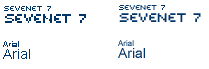
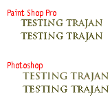
The samples above show the effects of antialiasing on two fonts. The top samples are Sevenet 7, a font designed to be used without antialiasing at a specific size. The lower sample is Arial shown at the a small and large size. In both cases, the left sample has antialiasing turned off. The right sample has Photoshop's Crisp antialiasing command applied. |
Antialiasing
|
|||
|
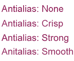
Different color combinations react in different ways to antialiasing. |
Every font behaves differently with different levels of antialiasing. To make the subject a little more challenging, the color of your text and background also affects the appearance of your antialiasing. Simply choose the settings that give you the best appearance. Make sure that you apply the same setting to text that is intended to match. You may wish to make a note of the settings you use for antialiasing on a large, multi-page project. In the sample at the left, I have used different settings for antialiasing in each line, but the same settings for the black and brown type on each line. Note how the same settings deliver different results for each color combination. There are few rules, other than using what looks best, that can be applied to antialiasing. Common advice recommends that text under 10 pts should be used without antialiasing, but I have seen exceptions to this. I have also seen 14 pt type that looks best with no antialiasing. Let's take a look at how several programs handle antialiasing. |
|||
|
|
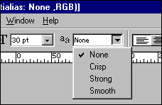
Antialiasing Text in Photoshop None: Adds no antialiasing. Edges may be jagged, but this setting is almost always used for small type sizes. Crisp: Adds minimal antialiasing to maintain a sharp edge. This setting is the least invasive antialiasing you can apply, and is the one that I use most often. Strong: Adds antialiasing to create a thicker look to the characters. This can be used when the normal font is a little light, but the bold version is too heavy. Smooth: This setting is designed to give you a very smooth edge, and is used most often for very large sized type. You will often find that there is little difference between this setting and the Crisp setting. |
|||
|
|
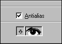
PaintShop Pro Antialiasing
|
|||
|
|
Menus with Beauty and Brains 3: Tutorial IndexSmall Fonts Continued |
 Antialiasing
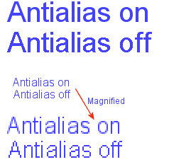
prevents jaggy edges. Since raster objects are created with pixels,
which are square, diagonal lines or curves will look very rough in raw
pixel format. To overcome this effect, antialiasing mixes the object
color with the color behind the object to create pixels of mixed color
where they meet. This effect tricks the eye into seeing smooth curves
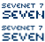
or lines, rather than square pixels. See the sample at the right which
provides a magnified view of antialiasing at work. The top sample has
no antialiasing and the bottom has Photoshop's Crisp antialiasing added.
Note how the edge pixels have been combined with a shade of white. Make
sure you compare this sample to the one at the left which shows the
same characters at actual size.
Antialiasing
prevents jaggy edges. Since raster objects are created with pixels,
which are square, diagonal lines or curves will look very rough in raw
pixel format. To overcome this effect, antialiasing mixes the object
color with the color behind the object to create pixels of mixed color
where they meet. This effect tricks the eye into seeing smooth curves
or lines, rather than square pixels. See the sample at the right which
provides a magnified view of antialiasing at work. The top sample has
no antialiasing and the bottom has Photoshop's Crisp antialiasing added.
Note how the edge pixels have been combined with a shade of white. Make
sure you compare this sample to the one at the left which shows the
same characters at actual size. 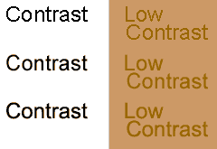

URL: https://www.webreference.com/graphics/column44/
Created: March 20, 2001
Revised: March 20, 2001
 Find a programming school near you