HTML Unleashed PRE. Creating Widely Accessible Web Pages: Layout
HTML Unleashed PRE: Creating Widely Accessible Web Pages | |
Layout |
|
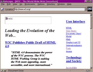
Yet web authors do require an effective means of arranging material on the page, and style sheets might not present a perfect solution because they aren't yet universally supported. This led to the "invention" and truly widespread deployment of various "ad hoc" layout tools, most notably tables and invisible spacer images. For a long time, this question has been hotly debated: Is it allowable to use HTML elements not for their primary purpose but for the sake of their layout-related side effects? Now the consensus seems to be that some of these "hacks" are relatively harmless for the accessibility of documents so long as proper care is taken in their implementation. An example of such sensible use can be seen on the home page of World Wide Web Consortium itself whose layout is based on a two-column table (see figure 42.1).
|
Tables |
|
What are the right and wrong ways of using HTML tables for layout? The answer to this question depends on what kind of access devices you're taking into account. For most non-graphic user agents including text-mode browsers, speech browsers, and automatic indexers, an HTML table is not a two-dimensional arrangement but a linear sequence of cells showing up in the order in which they are coded in the HTML source file. For your content to always make sense, then, you should keep the material as row-oriented as possible. Remember that only the cells that are next to each other horizontally will be read in sequence, while vertical neighbors most probably will be separated by other cells. For example, do not place a heading in one cell and the text it belongs to in another cell below that, as this is likely to result in the heading being separated from its text and making little sense on its own. Instead, place both the heading and the text in one cell using the rowspan attribute, if necessary, to force the cell to stretch down as needed. A quick way to check whether your layout meets this requirement is to strip away all HTML markup and read the remaining text in the source file looking for logical gaps and "hanging" material. The above-mentioned home page of W3C is an example of sensible use of tables because all pieces that are logically connected go sequentially in the source file (e.g. the rightmost column with the list of links is all contained in one cell). Unfortunately, headings being separated from their text isn't the worst scenario of the tables-for-layout drama. Some people that need a web page to be read aloud use, instead of specialized speech browsers, conventional graphic browsers combined with screen readers---programs that simply read out whatever there is on the screen (or within a window). A screen reader has neither access to nor understanding of the HTML source of the page, so it can only read, from left to right and from top to bottom, all the content of a browser window, completely disregarding any tabular arrangement. The "Unified Accessibility Guidelines" document suggests that web authors attempt to imitate this behavior by holding a piece of paper up to the monitor, moving it slowly down, and reading what is revealed across the entire window (a simpler method could use another program's window being dragged down). Naturally, W3C home page (see figure 42.1) fails spectacularly when tested this way; what you'll hear from your screen reader will be a mess of fragments from different columns: "W3C... User Interface... HTML... Leading the Evolution of the... Style Sheets... Document Object... Web... Model... Math... W3C Publishes Public Draft of HTML... Graphics and 3D" and so on. I do not know if it makes real sense to always pursue the "strict" accessibility with a consideration for screen reader users because that would totally eliminate any multi-column layouts---a serious price indeed. Perhaps we should avoid columns (or provide a parallel text-only page without any layout tricks) only for those pages that are relatively likely to be accessed using screen readers. |
Other Layout Tools |
|
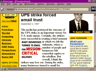
PREformatted text in monospaced font was widely used to present tabular material before the TABLE element was invented. Indeed it is, to some extent, an analog of the tabular layout because the PRE element allows you to control skips, indents, and alignments in the text. You must remember, however, that for disabled users with speech-only access, any positioning and white space are nonexistent, and only the text itself can be perceived. The practice of using BLOCKQUOTE elements for text indentation is also dangerous (in HTML 4.0 specification, this use is declared deprecated). Although in visual browsers BLOCKQUOTE is most often rendered with indents at both margins, you should remember that the real intended meaning of this logical tag is quotation, not indentation, and there are browsers that use other formatting conventions (e.g. start each line with a ">"). And since a speech browser has almost no means of "formatting" at all, it is very likely that it will simply surround the BLOCKQUOTE element with something like "begin quotation... end quotation"---which is not what you might expect if you used it only for indentation. One more dangerous layout feature is the align attribute, especially when it's used for images with alt texts (see "Images" later in the chapter). For a real-world example, analyze this fragment of a C|Net news article: |
The media has portrayed the outcome of the UPS strike as an important victory for U.S. trade unions. Certainly, the strikers were successful in <img src="/Images/Perspectives/Stories/9_97/per_mission.gif" width=132 height=121 border=0 align=left hspace=5 vspace=3 alt="Many businesses turned to email for mission critical delivery"> creating a brief moment in which we felt the stalemate, where a number of people and businesses felt somewhat captive to the rebellion. But overall, I think the strikers may lose out. |
|
Here, an IMG element is inserted right in the middle of a sentence. When viewed on a graphic browser, the image with a pull-out quote is moved to the left margin thanks to the align=left attribute (see figure 42.2). However, for a speech or text-mode browser, image alignment makes little sense and this attribute is therefore ignored. Here's what you'd hear pronounced by a speech browser or see displayed by a text-mode one: |
The media has portrayed the outcome of the UPS strike as an important victory for U.S. trade unions. Certainly, the strikers were successful in Many businesses turned to email for mission critical delivery creating a brief moment in which we felt the stalemate, where a number of people and businesses felt somewhat captive to the rebellion. But overall, I think the strikers may lose out. |
|
As you can see, the alt text gets intermingled with the body text making it scarcely comprehensible. The correct solution would be to avoid the image alignment attribute (for example, by using tabular layout) or, at the very least, to surround the alt value by a pair of brackets to make the mishmash more decipherable.
|
Revised: Sept. 19, 1997
URL: https://www.webreference.com/dlab/books/html-pre/42-4.html


 Find a programming school near you