Evolution of a Home Page 2001
Evolution of a Home Page
2001
- January 29, 2001 (zip file)
-
The HTML optimization continues. While taking a usability survey of the competition, I discovered that the average size of Web developer home pages (HTML only) was around 30K. Home pages ranged from 12K (Webtechniques.com) to well over 80K (you know who you are). A reasonable goal for any site is to match the average of your competition. I chose a goal of one half the average or 15K to provide a fast loading home page.
Speed
At our last update the front page was a hand-optimized 24K. I thought this was about as small as I could make it. Boy was I wrong. Using a variety of techniques I trimmed about 10K from the home page, with no appreciable change in appearance. Today the HTML weighs in at 14280 bytes. Here's what I learned along the way.
First, triage your optimizations. Do the things that save the most bytes first. Second, move to CSS. It's time. By moving from font-based design to rule-based design you can control discontiguous elements with one rule, saving valuable space. Third, simplify. Include only what's essential. Ask yourself, "Does this help the user?" Don't include all the sections of your site on your home page. It's too much to take in. Don't be verbose. Use short blurbs and headlines. Here are some highlights of the HTML optimization techniques we used.
- Automatic URL Abbreviation - We took our URL shortening campaign from last time to its logical conclusion. Using Apache's mod_rewrite module you can create shorter redirects for longer URLs (i.e., /r/pg = /programming/ etc.) that save space. We saved over 5K using this method. We've also automated the process and made the script open source so you can auto-abbrev your URLs on your site.
- Externalize JavaScripts - By loading our news flipper code last from an external file we saved 2700 bytes off the initial page load.
- Use CSS - Moving to rule-based design saves space as rules can apply to multiple instances. For example we went from:
<DT><B>...</B></DT><DD>...<P> to
DT{font-weight:bold;font-size:110%;margin-top:.6em;}
<DT>...<DD>
Rather than kludging space between our DTs with paragraphs we used CSS to set a top margin of .6em.
- Conditional META tags - By using conditional SSI you can only deliver what's absolutely necessary. In this case, browsers don't need meta tags, spiders do, so we only deliver meta tags to non-mozilla user agents (handles the majority of browsers out there, IE, NS, and default Opera), saving 586 bytes.
<!--#if expr="$HTTP_USER_AGENT = /^Mozilla/" -->
<!--#else -->
<META Name="keywords" Content="authoring web development ...">
<META Name="description" Content="The definitive guide...">
<!--#endif -->

-> 
- Random Links - Borrowing an idea from Webmonkey, we now display a random selection of 5 of our 12 services each time you view the page. This saves space and entices the user to explore further. Again, this script is available as open source.
- Automatic HTML Optimization - To clean up any extra spaces, returns, or comments left over from HTML newsletter creation etc. we created a simple HTML optimizer script that collapses two or more spaces or returns, and removes
all comments (excluding PRE, STYLE, and SCRIPTs). Again, this is available as open source.
In total, these optimizations trimmed about 10K or 41% off our front page's HTML. It went from 24168 to 14280 bytes. At typical 28Kbps or 56Kbps speeds (2-3K/sec) that means 3-5 seconds less wait for the front page to load. Those 5 seconds can make the difference between a user staying or bailing. Users typically will only wait around 8.5 seconds for a page to load. That equates to under 16K at typical connection speeds. As we discussed earlier, we also layer our tables for a staged load. The top table (now without META tags) now pops on the screen in less than a second. I think you'll agree that WebRef's response time is much improved. Looking at our logs, total impressions improved as our home page diet kicked in. I've detailed these optimizations (plus some more) in Extreme HTML Optimization.
Wireless Feeds
Thanks to Jonathan's Weblog you can now access WebRef anywhere, even from your phone. With our VoiceXML feed you can find what's new on WebRef using Tellme.com's 800 number (try it yourself: in the US dial 1-800-555-TELL at the tellme prompt dial/say 143444). These news feeds are a demonstration of what can be done with Weblog, our home page/RSS editing channel managing script. In the coming weeks we'll show you how to configure your news feeds, including adding interactivity to your VoiceXML.
Reference Color Codes
HTML Characters
Other Highlights
We broke our reference section out into a new section on the right vertical toolbar, with Stephanos' new color reference and HTML character reference sections. Look for more reference information in the future.
Code Tools HTML
JavaScript
We consolidated our numerous code-generating tools under the categories "HTML" and "JavaScript" to save space. I've got some more ideas for further HTML optimization, but I'm pretty happy with our response time for now. Until next time.
- March 21, 2001
-
Lots of improvements on and off the screen. Further extreme HTML optimization reduced the home page down to the 13K range. While highly illegal, the page flew onto the screen and worked in all browsers tested. However, my days of fast and loose HTML finally caught up with me when updating our DHTML news flipper for NS6/IE5.5. Turns out these new standards-based browsers rely on properly nested HTML to render CSS and execute external JavaScripts. Go figure.
Standards
So I saw the light. I got religion. I drank the standards-based kool-aid. Rather than just fix the bad nesting (</TD></FORM></TR>) I thought why not go all the way? Could I make the home page validate, and still appear identical? I'm happy to report I can and it does (sans the ad code's ampersands [&]). So with a little nudge from Netscape 6 I decided to move towards valid HTML on WebReference.com.
Without valid HTML (primarily properly nested tags) newer browsers cannot reliably apply CSS rules, and in some cases do not fully execute external scripts (see JavaScripting Netscape 6). In addition to our flipper, we also plan on using Peter's DHTML menus, so having valid HTML is a must. In the process of cleaning up our code I learned a few things along the way.
FORM Hack Begone
The standards-based way to suppress the FORM tag's return is to use CSS to display forms inline, rather than as a block tag. The only reliable way we found to align form elements vertically with Netscape 6 and suppress the extra vertical space is to create another table just for the FORM's INPUT field and
SUBMIT buttons, and surround this with a styled FORM tag, like this:
<style type="text/css">
<--
   form.tb {display:inline;}
-->
</style>
...
<form class=tb method=get action="https://webref.com/cgi-bin/search.cgi">
<table border=0 cellspacing=0 cellpadding=0>
   <tr><td>
      <input type=text name=query size=15>
   </td><td width="1%" align=right>
      <input type=submit value=search>
   </td></tr>
</table>
</form>
Surrounding the parent table with a form collapsed our top toolbar in Netscape 6 with an inline FORM, so adding an extra table became our solution for the front page, and our bottom toolbar. As Netscape 4 doesn't support CSS2 and displayed the extra vertical </FORM>'s space, we came up with a conditional SSI to close the form for consistent spacing:
<form class=tb method=get action="https://webreference.com/cgi-bin/search.cgi">
<table border=0 cellspacing=0 cellpadding=0>
   <tr><td>
      <input type=text name=query size=15>
   </td><td width="1%" align=right>
      <input type=submit value=search></td>
   <!--#if expr="((${http_user_agent} = /mozilla\/4/) &&
   (${http_user_agent} != /msie 5|6/))"-->
      </form></tr></table>
   <!--#else -->
      </tr></table></form>
   <!--#endif -->
This way, the page looks the same for NS4 and newer browsers, while validating for newer browsers. More importantly it should work with Peter's menus on NS5+/IE5+.
Bottom Toolbar Update
Speaking of the bottom toolbar, I added the newest three headlines from our internet.com highlights RSS channel just like we do for WebRef's headlines. We use our open source "pullrss.pl" script to grab N stories from a local RSS file. When we added our own headlines to the site-wide footer, our traffic increased dramatically. We're hoping we can do the same for internet.com. We're working on making this work with any RSS file, stay tuned.
Speed

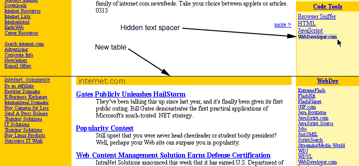
As you can see we've moved things around a bit. To speed the initial display, I split the front page into three main tables instead of two (see dotted lines in figure). The top one you've seen before, it holds our logo, nav bar, and ad. The second "above the fold" table holds mainly onsite info, and the third table shows everything else, except the bottom ad. The second table displays much faster now, as users don't have to wait for the "below the fold" info to flow into one big table.
Cosmetics
I moved the Doc's tip-o-the-day to the right using a right-aligned table (DIV FLOAT didn't work consistently), and freed up some vertical space. Eliminated all FONT tags (except the one mentioned below) and went to relative CSS for everything, except the headlines which are at 9pt. Trimmed one news box and moved "Stats" in its place to left column, above the fold.

Hidden Text Spacer
To make the table split seamless when users resize their fonts I used a hidden background-colored string "WebDeveloper.com" (using FONT COLOR=background) that matches the longest continuous string (no spaces) in the same column below it. By using identically-sized strings inside identical tables you can guarantee that your tables will resize in synch and appear to be one seamless whole.

Other changes include non-random services (I realized that users want easy one-click access, not incremental speed improvment), and a new XML reference section.
JavaScript News Flipper
To update our DHTML news flipper for Netscape 6 and IE5.5 we tweaked our code and used an SSI to directly include the JavaScript code inside the home page. This guarantees that the flipper works with NS6. Even though we now have a valid page, the flipper doesn't work when it is dynamically written. We're still investigating using external files with NS6. Until next time.
- May 18, 2001 - Experimental CSS
- They said it couldn't be done. A 3-column, table-like layout in CSS? No way. I was doubtful myself, and posted as such. But then Kwon Ekstrom emailed me with a prototype that looked remarkably like our home page. He and I went back a forth, tweaking and adjusting the CSS. And I then realized, it is possible to create an intricate table-like layout with CSS. The first version above was the final shell we came up with. Then I added in some floats for the top search form, and "Tip of the Day" in the second version. The third version I changed the solid borders to dotted, for that stylish look. You can see from the content I started with, that iterating through the various versions/browser bugs has taken a while. These CSS layouts work in IE5+ Mac/Win and NS6+, and Opera 5+. Enjoy.
Note: The CSS used in these pages is not optimized, but illustrative. I'm sure there could be some improvements, let me know what you come up with.
Speed
At our last update the front page was a hand-optimized 24K. I thought this was about as small as I could make it. Boy was I wrong. Using a variety of techniques I trimmed about 10K from the home page, with no appreciable change in appearance. Today the HTML weighs in at 14280 bytes. Here's what I learned along the way.
First, triage your optimizations. Do the things that save the most bytes first. Second, move to CSS. It's time. By moving from font-based design to rule-based design you can control discontiguous elements with one rule, saving valuable space. Third, simplify. Include only what's essential. Ask yourself, "Does this help the user?" Don't include all the sections of your site on your home page. It's too much to take in. Don't be verbose. Use short blurbs and headlines. Here are some highlights of the HTML optimization techniques we used.
- Automatic URL Abbreviation - We took our URL shortening campaign from last time to its logical conclusion. Using Apache's mod_rewrite module you can create shorter redirects for longer URLs (i.e., /r/pg = /programming/ etc.) that save space. We saved over 5K using this method. We've also automated the process and made the script open source so you can auto-abbrev your URLs on your site.
- Externalize JavaScripts - By loading our news flipper code last from an external file we saved 2700 bytes off the initial page load.
- Use CSS - Moving to rule-based design saves space as rules can apply to multiple instances. For example we went from:
<DT><B>...</B></DT><DD>...<P> to DT{font-weight:bold;font-size:110%;margin-top:.6em;} <DT>...<DD>Rather than kludging space between our DTs with paragraphs we used CSS to set a top margin of .6em.
- Conditional META tags - By using conditional SSI you can only deliver what's absolutely necessary. In this case, browsers don't need meta tags, spiders do, so we only deliver meta tags to non-mozilla user agents (handles the majority of browsers out there, IE, NS, and default Opera), saving 586 bytes.
<!--#if expr="$HTTP_USER_AGENT = /^Mozilla/" --> <!--#else --> <META Name="keywords" Content="authoring web development ..."> <META Name="description" Content="The definitive guide..."> <!--#endif -->
-> 
- Random Links - Borrowing an idea from Webmonkey, we now display a random selection of 5 of our 12 services each time you view the page. This saves space and entices the user to explore further. Again, this script is available as open source.
- Automatic HTML Optimization - To clean up any extra spaces, returns, or comments left over from HTML newsletter creation etc. we created a simple HTML optimizer script that collapses two or more spaces or returns, and removes all comments (excluding PRE, STYLE, and SCRIPTs). Again, this is available as open source.
In total, these optimizations trimmed about 10K or 41% off our front page's HTML. It went from 24168 to 14280 bytes. At typical 28Kbps or 56Kbps speeds (2-3K/sec) that means 3-5 seconds less wait for the front page to load. Those 5 seconds can make the difference between a user staying or bailing. Users typically will only wait around 8.5 seconds for a page to load. That equates to under 16K at typical connection speeds. As we discussed earlier, we also layer our tables for a staged load. The top table (now without META tags) now pops on the screen in less than a second. I think you'll agree that WebRef's response time is much improved. Looking at our logs, total impressions improved as our home page diet kicked in. I've detailed these optimizations (plus some more) in Extreme HTML Optimization.
Wireless Feeds
Thanks to Jonathan's Weblog you can now access WebRef anywhere, even from your phone. With our VoiceXML feed you can find what's new on WebRef using Tellme.com's 800 number (try it yourself: in the US dial 1-800-555-TELL at the tellme prompt dial/say 143444). These news feeds are a demonstration of what can be done with Weblog, our home page/RSS editing channel managing script. In the coming weeks we'll show you how to configure your news feeds, including adding interactivity to your VoiceXML.
| Reference |
| Color Codes HTML Characters |
Other Highlights
We broke our reference section out into a new section on the right vertical toolbar, with Stephanos' new color reference and HTML character reference sections. Look for more reference information in the future.
| Code Tools |
| HTML JavaScript |
We consolidated our numerous code-generating tools under the categories "HTML" and "JavaScript" to save space. I've got some more ideas for further HTML optimization, but I'm pretty happy with our response time for now. Until next time.
Standards
So I saw the light. I got religion. I drank the standards-based kool-aid. Rather than just fix the bad nesting (</TD></FORM></TR>) I thought why not go all the way? Could I make the home page validate, and still appear identical? I'm happy to report I can and it does (sans the ad code's ampersands [&]). So with a little nudge from Netscape 6 I decided to move towards valid HTML on WebReference.com.
Without valid HTML (primarily properly nested tags) newer browsers cannot reliably apply CSS rules, and in some cases do not fully execute external scripts (see JavaScripting Netscape 6). In addition to our flipper, we also plan on using Peter's DHTML menus, so having valid HTML is a must. In the process of cleaning up our code I learned a few things along the way.
FORM Hack Begone
The standards-based way to suppress the FORM tag's return is to use CSS to display forms inline, rather than as a block tag. The only reliable way we found to align form elements vertically with Netscape 6 and suppress the extra vertical space is to create another table just for the FORM's INPUT field and SUBMIT buttons, and surround this with a styled FORM tag, like this:
<style type="text/css">
<--
form.tb {display:inline;}
-->
</style>
...
<form class=tb method=get action="https://webref.com/cgi-bin/search.cgi">
<table border=0 cellspacing=0 cellpadding=0>
<tr><td>
<input type=text name=query size=15>
</td><td width="1%" align=right>
<input type=submit value=search>
</td></tr>
</table>
</form>
Surrounding the parent table with a form collapsed our top toolbar in Netscape 6 with an inline FORM, so adding an extra table became our solution for the front page, and our bottom toolbar. As Netscape 4 doesn't support CSS2 and displayed the extra vertical </FORM>'s space, we came up with a conditional SSI to close the form for consistent spacing:
<form class=tb method=get action="https://webreference.com/cgi-bin/search.cgi">
<table border=0 cellspacing=0 cellpadding=0>
<tr><td>
<input type=text name=query size=15>
</td><td width="1%" align=right>
<input type=submit value=search></td>
<!--#if expr="((${http_user_agent} = /mozilla\/4/) &&
(${http_user_agent} != /msie 5|6/))"-->
</form></tr></table>
<!--#else -->
</tr></table></form>
<!--#endif -->
This way, the page looks the same for NS4 and newer browsers, while validating for newer browsers. More importantly it should work with Peter's menus on NS5+/IE5+.
Bottom Toolbar Update
Speaking of the bottom toolbar, I added the newest three headlines from our internet.com highlights RSS channel just like we do for WebRef's headlines. We use our open source "pullrss.pl" script to grab N stories from a local RSS file. When we added our own headlines to the site-wide footer, our traffic increased dramatically. We're hoping we can do the same for internet.com. We're working on making this work with any RSS file, stay tuned.
Speed

As you can see we've moved things around a bit. To speed the initial display, I split the front page into three main tables instead of two (see dotted lines in figure). The top one you've seen before, it holds our logo, nav bar, and ad. The second "above the fold" table holds mainly onsite info, and the third table shows everything else, except the bottom ad. The second table displays much faster now, as users don't have to wait for the "below the fold" info to flow into one big table.
Cosmetics
I moved the Doc's tip-o-the-day to the right using a right-aligned table (DIV FLOAT didn't work consistently), and freed up some vertical space. Eliminated all FONT tags (except the one mentioned below) and went to relative CSS for everything, except the headlines which are at 9pt. Trimmed one news box and moved "Stats" in its place to left column, above the fold.

Hidden Text Spacer
To make the table split seamless when users resize their fonts I used a hidden background-colored string "WebDeveloper.com" (using FONT COLOR=background) that matches the longest continuous string (no spaces) in the same column below it. By using identically-sized strings inside identical tables you can guarantee that your tables will resize in synch and appear to be one seamless whole.

Other changes include non-random services (I realized that users want easy one-click access, not incremental speed improvment), and a new XML reference section.
JavaScript News Flipper
To update our DHTML news flipper for Netscape 6 and IE5.5 we tweaked our code and used an SSI to directly include the JavaScript code inside the home page. This guarantees that the flipper works with NS6. Even though we now have a valid page, the flipper doesn't work when it is dynamically written. We're still investigating using external files with NS6. Until next time.
Note: The CSS used in these pages is not optimized, but illustrative. I'm sure there could be some improvements, let me know what you come up with.
        
|
Revised: May 25, 2001
URL: https://www.webreference.com/dev/evolution/2001.html


 Find a programming school near you