Banner Ad Location Effectiveness Study | 2
Banner Ad Placement Study
Theory: Click through will be higher if the ad is placed approximately 1/3 of the way down the page
Method
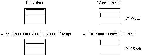
Two ad locations were tested for this study, 1/3 down the monitor screen and across the top of the page. Each location was tested for 1 week. The goal was to run the studies on high traffic pages.
Each of the boxes shown below represents the web screen (the visible area on user monitor, the actual page can be much longer). The smaller boxes represent the ad locations on the screen. The name of the company whose ads were shown is given above the boxes. The URL of the page on Webreference is shown between the two rows of boxes. Each column then represents the page and company. Each row represents the ad location being shown on the web page during that week.

Results
Listed below are the results from the study. Hypothesis testing was used to test the statistical significance of the results. View hypothesis testing calculations.
Note: The links to the illustrations of the advertisements contain both locations in the study on the same page. Data was collected at each location for approximately 1 week.
Search Contents Page (view advertisements on page)
|
|
|
|
|
|
|
|
|
|
|
|
|
|
|
|
|
|
||
|
|
|
Search Results Page (view advertisements on page)
|
|
|
|
|
|
|
|
|
|
|
|
|
|
|
|
|
|
||
|
|
|
Conclusions
Based on the above results, we conclude that the placement of the ad 1/3 down the screen, increased click-through 77% (for the Photodisc ad). The Webreference ad showed the same trend, but the result was not statistically significant.
Comments are welcome
Created: Apr. 21, 1997
Revised: Apr. 27, 1997
URL: https://webreference.com/dev/banners/onethird.html


 Find a programming school near you