3-D Animation on the Web: Animating the Company Image - webreference.com
      |
Animating the Company Image |
|
Animating an existing print logo is a real creative challenge. |
In the future, when the Web is well established as a commercial vehicle, companies will approach the logo and corporate ID process with animation already in mind. Right now, the typical client thinks in terms of "animating" its existing print logo. This is a real creative challenge. A good print logo and a good animated logo have different virtues, and the trick is to maintain a continuity of identity between the two without sacrificing the "pop" that an animated logo must have to be worthwhile. There must be an animation concept, but that concept must harmonize with the still image. One approach, and the best one where the print logo allows it, is to develop an animated logo to actually replace the still graphic completely on the web page. To do this, there must be something about the still image that suggests animatable possibilities. The following is the still logo, at full resolution, of a client company, a graphic arts firm, named Visible Ink.  This logo has inherent 3-D animation potential. The "V" in the foreground is already has 3-D perspective and lighting. More important, the still logo already suggest movement--an explosion. The company name, Visible Ink, suggests the possibilities both of ink spreading out on a page, and of invisibility (invisible ink, the natural association on which the company name plays). Using these ideas, the following animated logo is designed. |
 |
Note that the animated image, though only 100 pixels square, uses more apparent space because the white background area in the GIF merges into the white of the surrounding page. Note also how effective wave motion is the creating pleasing loops, and the sense of small fireworks popping off in the sky. |
The Compound Logo |
It will be far more common, however, to determine that the existing logo cannot be so easily animated itself and that the web image must be compounded of a new animated element attached to some part of the established still image--usually the text portion of the logo. Screen text generally, and logo text especially, must be large enough to be very readable. This means that it will almost never be possible to include the text in the animated frame--which will be 130 pixels in one dimension at the very largest to maintain reasonable file sizes. Rather, the text portion must be handled as a still GIF file and laid out with the animation. The following example creates a strong contemporary feel for a Wall Street firm using a small animation we have already seen. |
  |
|
|
Another approach is one that I have used in my own logo, which combines an animated magical touch with a still image. This approach has a considerable creative potential, especially where the client is wedded (often justifiably) to a high quality still image. Notice that this animation uses two simple primitives, so that there is no modeling. But there is lots of shading from hand painted bitmaps--which are called "texture maps" in the 3-D world even where they do not create apparent texture.
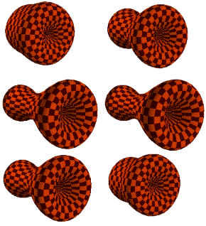
  Motion is immeasurably important in creating the right image. The following logo for a fictitious biotechnology firm uses an "organic" kind of movement suggesting, perhaps, a beating heart. This is a matter of animation timing and fluid geometry. A technology firm might rather employ a "mechanical" feel to the movement in its logo.
  |
|
Created: Jan. 14, 1997
Revised: May 11, 1997
URL: https://webreference.com/dev/3d/logo.html


 Find a programming school near you