Abstract
The Challenge: Replicate WebRef's front page using CSS. The Solution: CSS and lots of iterations.
Rogelio Lizaolo improves on Kwon Ekstrom's CSS version of WebRef's tabled home page. Months in the making, the final design successfully duplicates WebRef's layout without the use of tables. Numerous bugs were discovered in Netscape and Internet Explorer in how they handle CSS, and we found some elegant workarounds to these and other problems. What follows is a step by step CSS layout tutorial that shows how we got to the final design.
Introduction
In "Evolution of a Home Page" Andy King threw down the gauntlet, challenging readers to duplicate WebRef's tabled (and fabled) home page in CSS. Kwon Ekstrom came up with a solution, that worked in a number of browsers. After investigating his solution, I found a few problems with his design, and thought I'd try and improve on it. Andy, Kwon, and I went back and forth over a number of months tweaking and improving my design. What follows is a step-by-step account of my attempt to duplicate WebRef's table-like layout using CSS, while avoiding some of the bugs and problems found in other implementations.
The target browsers are all the generation five and greater browsers, for both Windows and Macintosh platforms. We are also looking to use the same style rules for all of these browsers. This constraint makes the task more difficult and the final code larger and more complex than it would be for a browser with good compliance to CSS level 2, like Netscape 6. Thus, we cannot use those features that aren't supported for all browsers and sometimes the necessary workarounds to solve bugs or other problems yield a not so straightforward use of CSS.
The Layout Challenge
The WebReference home page circa Spring 2001 has six big blocks that hold and organize the content (using three main tables to lay out the page):
- A top navigation bar with five text links and a search form.
- An advertisement block that holds a banner.
- A left navigation bar that holds the WebReference logo and text links.
- A right navigation bar that holds text links organized as the structure of the site.
- A main content area that holds the most recent articles and resources in the site.
- A colored box inside the main area that holds the "Tip of the day"
Can this complex layout be replicated using only CSS? Yes indeed! Read on to find out how. Disregarding the top navigation bar, the advertisement block and the "Tip of the day" we have a three column layout. We can ensure that the middle column is going to be the one with more content, and therefore, the height of the document will be dictated by this block, and the three columns should be the same size vertically. Notice that there is a white gap that separates the left column from the main content area and another one that does the same for the right column. These separators have the same width (9 pixels) as the margins around the table to the edge of the browser window.
3 Column Layout: Step by Step
To start, let's make a simple three column layout with gaps between the columns, with the center column content dictating the height of the entire document. We will start with four divs and their respective style declarations.
- First we set the margin and padding from the body element with the following code to give the desired appearance. Notice that we need to set the padding because Opera's default is not zero. Also, we set the background color to white, because Netscape 6 for the Macintosh defaults to a background color of gray.
- Now we define our first element, a
divthat we will give anidattribute value to "level0." The only style definition for this element will be a background color, the color we want for the left column. Take a look - We nest a second
divinside "level0" and give it theid"level1" thus:This new
divis going to make the space for the left column and left separator. The left column area will be reserved using a left margin for "level1" and the separator using a left padding, so we will need to set the background color from "level1" to the desired color for the separator. Take a look - We nest inside "
level1" adivwithid"level2".We only change the background color of this new
div. Now we can see clearly the left column and its separator. Take a look - We use the same technique, nest a "
level3"divinside "level2" to get the visual layout for the right column.This time we will nest another
divcalled "main" just to set its background color different from transparent, and so we can highlight the columns and the separators. Take a look
Add the Top Nav and Ad Bars
We haven't made the code for the right and left columns content yet, just the visual layout, but we have illustrated the basic technique to display three columns and make them exactly the same height. So before discussing this issue let's put the top navigation bar and the advertisement block in place. We are going to nest inside "level1" and before "level2" a div with an id set to "topBar," and inside "topBar" we nest another div with an id set to "advBar." Take a look
Float the Tip-o-the-Day
We have at the moment three blocks where we can put some content, the main area, the top navigation bar and the advertisement block. Each one will be as high as its content demands, but we have constrained their widths so the blocks for the left and right navigation bars won't be invaded by the content in these div elements. Let's put in place the "Tip of the day" box using the float property so the content in the main area will flow around as needed. We put a div with id "tipDay" inside the "main" div, set the float property to right and declare its width to some value (be sure to declare the width for all the elements with float set to a value other than none). Take a look
Content Anyone?
Now let's tackle the problem on how to put content in those bars. The more natural way of doing it would be to use the float property, but due to Opera and IE's rendering problems with this technique we need to rely on absolute positioning to get things done. The IE bug is minimal, and could be disregarded but there is no way to solve the Opera bug that we discovered. Take a look at the links below for a description and example on these bugs.
 Find a programming school near you
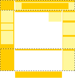